Best architecture projects of 2023
IQD has selected the best architectural projects built around the world in the period between 2022 and 2023
The Hole with the House Around / Elastico Farm
- Architect: Elastico Farm
- Place: Cambiano, Italy
- Photographer: Anna Positano, Gaia Cambiaggi | Studio Campo
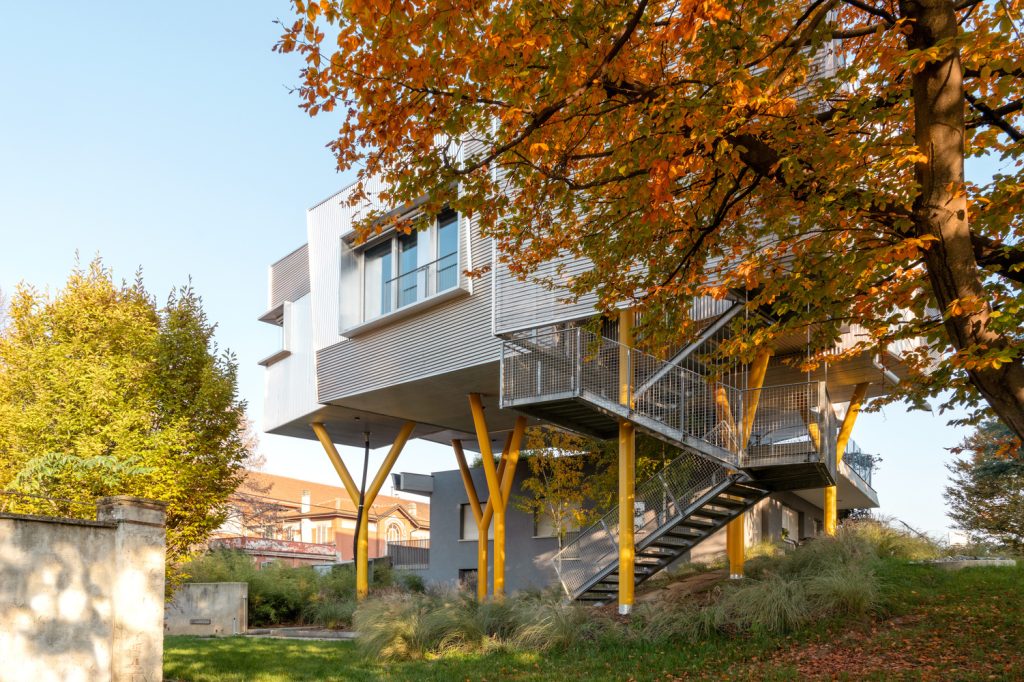
The new residential project by Stefano Pujatti of ELASTICOFarm is located on the outskirts of Cambiano, a small town at the foot of the Turin hills, a few kilometers from capital city of Piedmont. The context is that of an uneven urban area, characterized by the remains of old industrial buildings and recent residential developments, from which the project is removed thanks to the extensive private park full of large trees that surrounds it and provides a natural filter to the outside environment. The original two-family house was a building dating back to the early 1970s, which the owners had decided to renovate and extend. Instead of expanding the existing building, the project has envisaged its renovation and the construction of a new living unit, whose volumes overlook the original building, leaning on it minimally, the strictly necessary to allow access to the roof, transformed into a private terrace with panoramic views from the nearby hills to the majesty of the Alps. Echoing the foliage of the trees that surround them, the volumes of the new unit, suspended on pillars at their same height, gather around a central hole, which accentuates the sense of vertigo and the detachment from the ground and which, left unpaved, is a gift to plants and nature for them to take possession of. Read the full article here
Els Masovers / David Closes i Núñez
- Architect: David Closes i Núñez
- Place: El Masnou, Spain
- Photographer: José Hevia
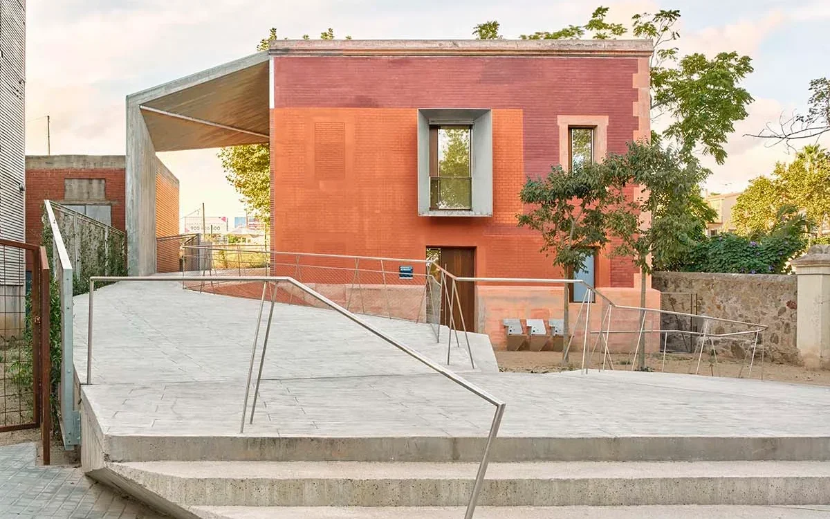
Having completed the renovation work of the Casa dels Masovers, designed by architect David Closes i Núñez, the Catalan town of El Masnou has now a new Civic Center and a 420 m2 public space where to rest and walk, with direct access to the Municipal Football Field on a walkway built in 2020, during the second phase of the project. The renovation of the structure involved the roof, the façades, the window fixtures and the internal spaces, today characterized by large and bright rooms. The water, thermal and electrical systems have been redone, and an internal elevator has been built which connects the three levels of the structure, allowing access also to citizens with disabilities. Read the full article here
Richard Gilder Center at the American Museum of Natural History / Studio Gang
- Architect: Studio Gang
- Place: New York, Usa
- Photographer: Iwan Baan
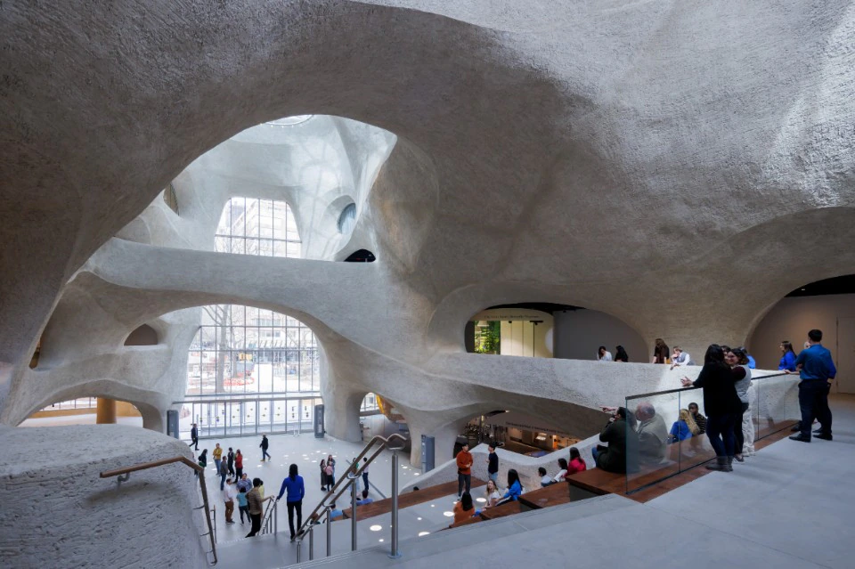
The Richard Gilder Center for Science, Education, and Innovation is the latest addition to New York’s historic American Museum of Natural History. At a time of urgent need for better public understanding of science and greater access to science education, the Gilder Center is designed to amplify the intellectual impact of the Museum with experiential architecture that encourages exploration—drawing in people of all ages, backgrounds, and abilities to share the excitement of scientific discovery and learning about the natural world. Read the full article here
Rajkumari Ratnavati School / Diana Kellogg Architects
- Architect: Diana Kellogg Architects
- Place: Jaisalmer, Rajasthan, India
- Photographer: Vinay Panjwani
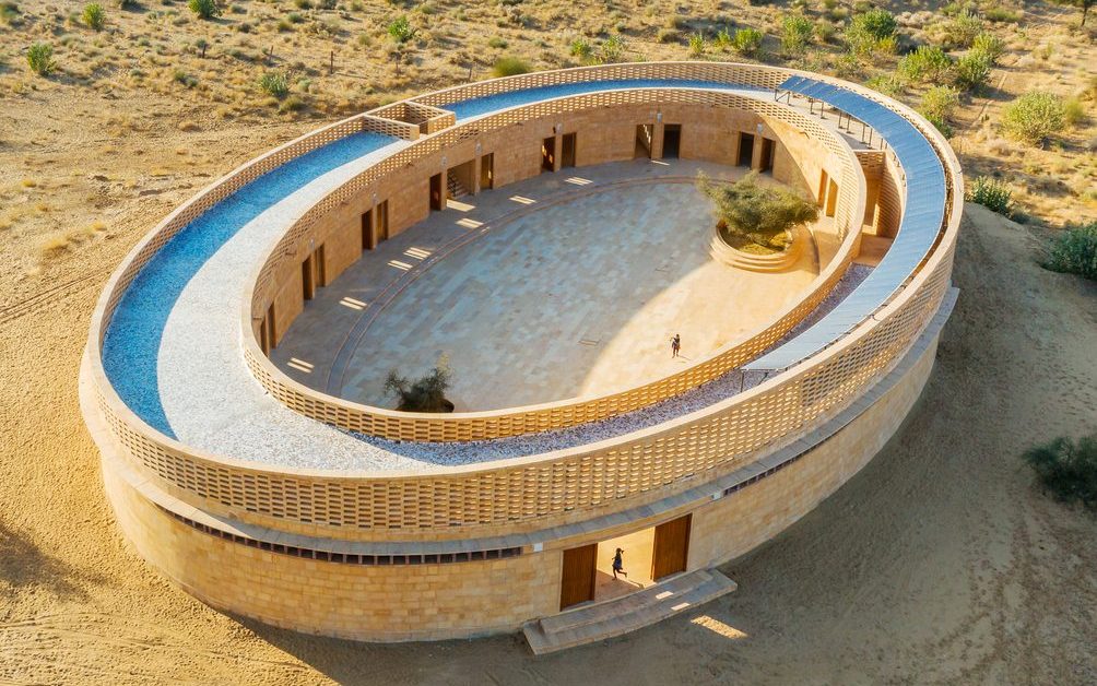
The Rajkumari Ratnavati School I designed in Jaisalmer, Rajasthan, India was for me a unique opportunity to create a sense of pride, belonging, and equity among the local community of girls and women. The school serves more than 400 girls, from below the poverty line in Jaisalmer, where female literacy barely touches 36%. Together with a team of female architects, we’ve created a safe place for these girls, a place for freedom, joy and discovery. I was commissioned for this project by The Citta Foundation, which has a commitment to women’s issues across the world. I saw how their existing projects had acted as a catalyst for a development extending far beyond the location of the project itself. Read the full article here
(W)rapper / Eric Owen Moss Architects
- Architetct: Eric Owen Moss Architects
- Place: Los Angeles, USA
- Photographer: Tom Bonner Photography
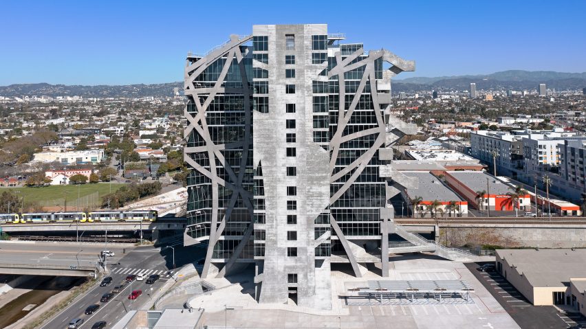
Eric Owen Moss Architects recently completed construction of (W)rapper, a new 235-feet tall office building and the latest EOMA contribution to an on-going 35-year revitalization plan for a former industrial and manufacturing zone in Central Los Angeles and Culver City, California. Located along the Expo Line light rail connecting West Los Angeles with Downtown, the project conforms to the City’s long term planning goal to increase density along mass transit routes, in this case, in a neighborhood that historically limited heights to 45 feet. (W)rapper’s structural concept originated in 1998 and was first presented in an exhibit at the Wexner Center in Columbus, Ohio. Unlike conventional high-rise structural systems based on columns organized along modular grid lines, (W)rapper is supported by a network of curvilinear bands originating from a number of geometric center points. Each curving band is wrapped around the largely rectilinear building envelope, and folded around each vertical and horizontal corner of the building until it reaches the ground. Read the full article here
Fábrica de Cultura: School of Arts and Popular Traditions (EDA) / Alfredo Brillembourg and Hubert Klumpner UTT@ETH Zurich
- Architects: Alfredo Brillembourg and Hubert Klumpner UTT@ETH Zurich
- Place: Barranquilla, Colombia
- Photographer: Copyright Klumpner Chair of Architecture and Urban Design ETHZ / Alejandro Arango and Luis Bernardo Cano. Gregory Alonso
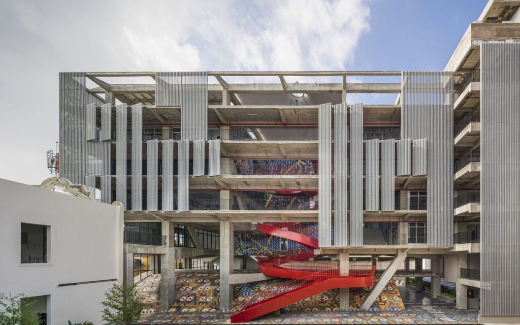
We had in mind a place where all the work that goes into the carnival could be housed, in a location where that activity could also serve as the engine for urban development and renewal. It would bring people together in their common endeavors and heighten the visibility of this cultural patrimony. Teaming up with the Mayor and local stakeholders, we identified the perfect site. Between Barrio Abajo and the old city center is an area once home to small industry and individual workshops, a district already targeted for urban renewal. There we found an old, abandoned tobacco factory, on a street that was being redesigned as an avenue. The building was acquired by the city, to be developed using municipal funds and the proceeds of the national lottery. It took us a year to understand what each of the arts did and needed: What kind of space? What should its dimensions be? What would be occupied full-time and what could be shared? We designed an open concrete building, tied around the old building through a courtyard. The classrooms are flexible, and each performance space is given the required height and width. A semisunken auditorium, seating five hundred, is topped by a sequence of large, intersected Catalan brick vaults (below), a response to the smaller vaults in the old building. The open space between the top of the vaults, which rise only a couple of meters above grade, and the new building’s concrete platform serves as a kind of playground. To make the school sustainable and economically viable, the building uses natural ventilation; solar panels will provide power. Read the full article here
A Restoration and Adaptive Reuse Project for Nizhny Novgorod’s Pack-houses / SPEECH Architectural Bureau
- Architect: SPEECH Architectural Bureau
- Place: Nizhny Novgorod, Russia
- Photographer: Dmitry Chebanenko, Ilya Ivanov
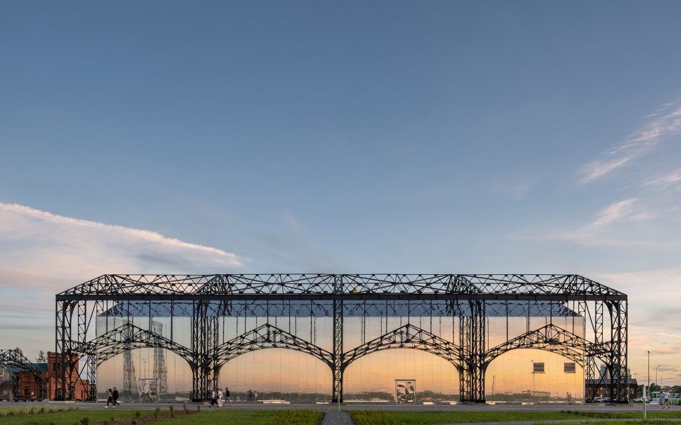
The city of Nizhny Novgorod in central European Russia is the fifth most populous city in the state and an important political, economic, and cultural center. Already in the 19th century, thanks to its strategic position at the confluence of the Volga and Oka rivers, the city was one of the main trading centers of the Russian Empire. In Strelka, the natural pointed spit formed by the confluence of the two rivers – today offering a panoramic view of the city, the rivers, the Alexander Nevsky Cathedral and the new stadium – thousands of merchants used to load and unload the goods brought by river, especially when they came for the famous annual Fair. Finally, two years after the start of their restoration, designed by firm SPEECH Architectural Bureau – restoration which included the removal of the old layers of paint and dust and the application of four layers of paint, one of which of high-tech frost-resistant paint in a shade similar to the natural color of the original dark iron – since 2022 the iconic structures are again on view, enveloping two modern buildings that house a concert hall and an art gallery. Read the full article here
Reggio School / Andrés Jaque Office for Political Innovation
- Architect: Andrés Jaque Office for Political Innovation
- Place: Madrid, Spain
- Photographer: José Hevia
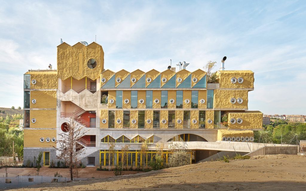
Inspired by the ideas of the Reggio Emilia method, developed in the Italian city at the end of the Second World War by pedagogist Loris Malaguzzi, representing the community’s need to promote a recovery through the education of children, the new Reggio School in Encinar de los Reyes, Madrid – designed by architect Andrés Jaque of Office for Political Innovation and completed at the end of 2022 – is an architectural manifesto of creative freedom. Based on the idea that spaces can arouse in students a desire for exploration and research, the building is thought of as a complex ecosystem that allows them to build their own knowledge through a process of self-driven collective experimentation, thus developing their skills and potentials. Architect Jaque – Dean and Professor of Columbia University Graduate School of Architecture, Planning and Preservation in New York – has created a perfect fusion between architecture and pedagogy by transferring into the project the principles of the school, according to which the three great educators are teachers, family and spaces. Read the full article here
Kingway Brewery Renovation / URBANUS
- Architect: URBANUS
- Place: Shenzhen, China
- Photographer: TAL, Kangyu Hu
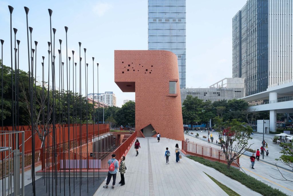
The Kingway Brewery is located in Luohu, the downtown district of Shenzhen Special Economic Zone, renowned for its early development. Kingway Beer has been the collective memory of Shenzheners, especially among the pioneers and migrants from all over China to pursue their dreams in this frontier city of China’s reform and opening-up. As Shenzhen proceeds with its radical urban development and industrial upgrade, shifting from traditional manufacturing to a smart economy, a substantial part of Kingway Brewery’s standing structures was demolished, leaving a rectilinear site of about 11,600 square meters vectoring north to south, marking the city’s industrial heritage, urban development and memories of past endeavors, glories, and entrepreneurial pioneering spirit. Following the notion of “Space as Exhibition”, URBANUS started with the rediscovery and transformation of the spatial features of the site and renovated the remaining industrial structures and facilities with flexible and creative use of spatial interventions and integrations, leading to an out-of-the-ordinary spatial experience. It has effectively transformed Kingway Brewery into a public cultural platform of new urban life. Read the full article here
Alférez House / Ludwig Godefroy Architecture
- Architect: Ludwig Godefroy Architecture
- Place: Cañada de Alferes, Lerma, Mexico
- Photographer: Rory Gardiner
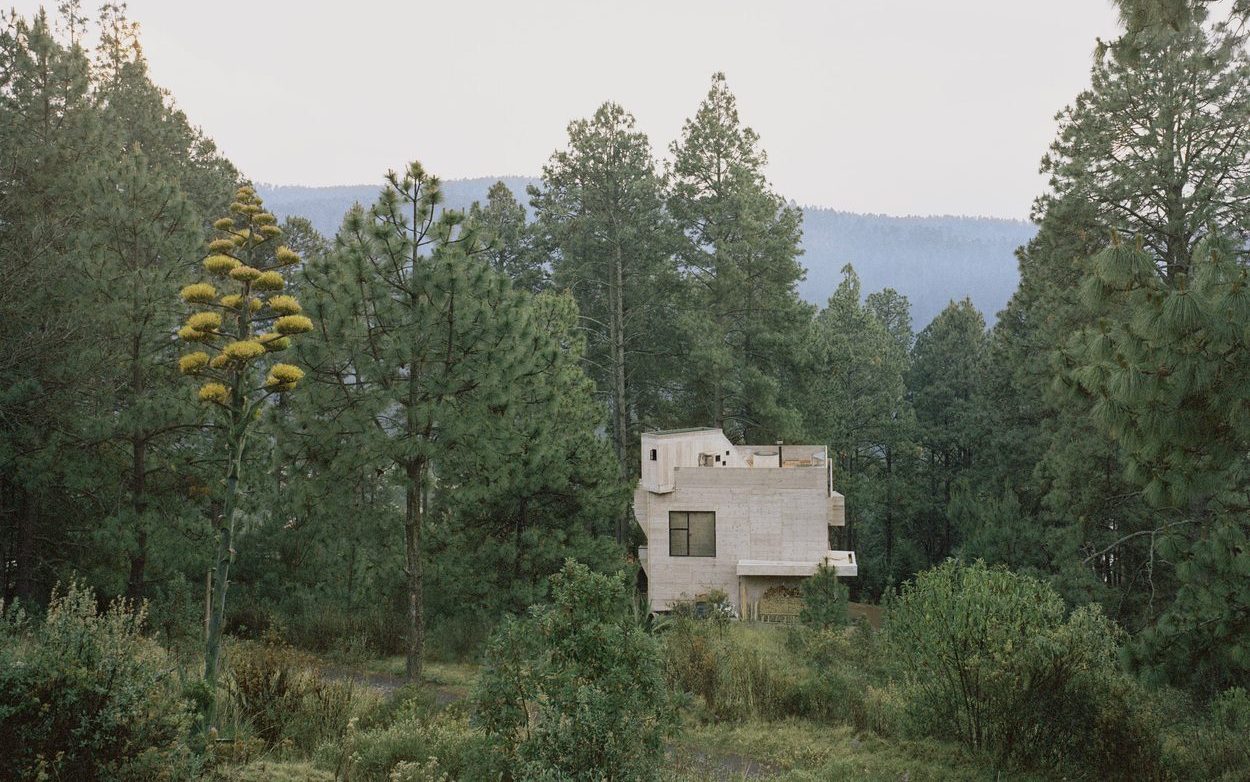
Ludwig Godefroy was commissioned to design a holiday home about an hour outside of Mexico City, in a Mexican pine forest Alferes region, called Casa Alférez. The project of the house of the Alférez Gorge takes its origin from the concept of a cabin and the romantic idea of a protective shelter in the middle of the forest; an isolated house seeking to resemble an object that would have been deposited on the ground, among the trees. The design of the house is developed based on 3 main points. The project responds to the idea of an isolated house in the forest, without ever losing sight of the need for a strong sense of security; a house as a safe, made of concrete that defends and takes care of its inhabitants. The result is a house that is characterized by its meeting of language between the idea of the cabin -a romantic element-, and the fortress -a protective element-, expressing brutalism in its concrete. The concrete comes to close and defend the first floor, while the windows are placed out of reach to prevent a possible outside intrusion. Read the full article here
BnF Bibliothèque Nationale de France / Atelier Bruno Gaudin
- Architect: Atelier Bruno Gaudin
- Place: Paris, France
- Photographer: Takuji Shimmura and Marchand Meffre
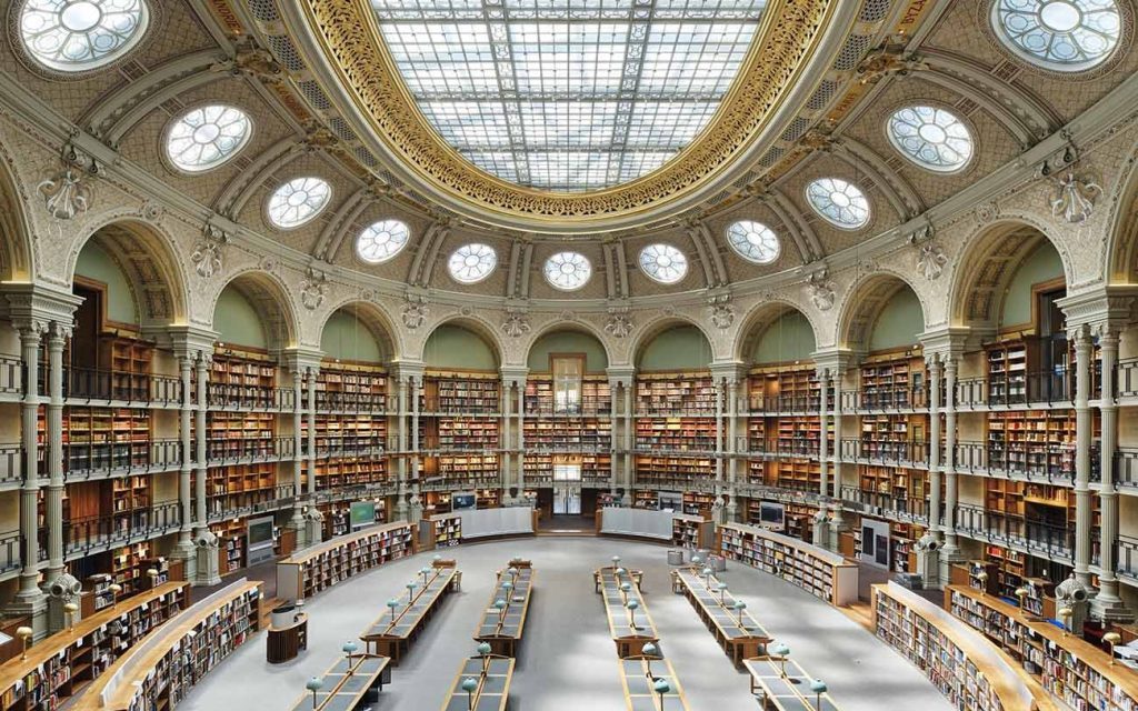
After over a decade from the start of the regeneration and restoration works, divided into two phases, the historic Bibliothèque Nationale de France in Paris reopened to the public last September. Strongly opposed by the architectural and scientific community, as it was accused of having removed important elements of historical value, the intervention has transformed the large cultural complex – as we read in the press release of Atelier Bruno Gaudin, project management studio – to meet the contemporary challenges related to welcoming a wider public, opening it up to the urban spaces and sharing with the younger generations. The new well-lit identity of the complex started with the creation of a new entrance to the Vivienne Garden, and of a vast hall with a new, modern staircase in the center of the composition. This entrance, which has allowed the new poetic garden to take its place, reunites three façades that were once at the back of the complex and have now become entrance façades to the Vivienne and Roux-Spitz halls. While the historic mineral and closed Courtyard of Honor respects the tradition of the silence necessary for research works, the design of this new entrance, with its planted threshold open to the city, reflects the desire to invite everyone to discover its world, both a library and a museum presenting its treasures. Read the full article here
Charles Nègre Media Library / Ivry Serres, Emmanuelle Beaudouin and Laurent Beaudouin
- Architects: Ivry Serres, Emmanuelle Beaudouin e Laurent Beaudouin
- Place: Grasse, France
- Photographer: Fernando Guerra – FG+SG / Simone Bossi
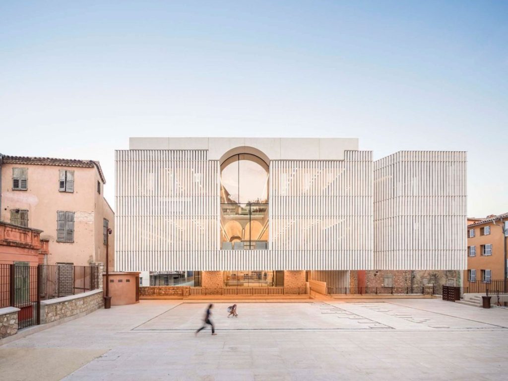
The city of Grasse in the south of France is particularly touching because of its urban characteristics: narrow streets, freshness, colour, relationship to the sky, vaulted passages, steep slopes. The new Charles Nègre media library, designed by Emmanuelle and Laurent Beaudouin and Ivry Serres is based on an architectural approach that is very attentive to the context and fits in well with the city’s heritage. The media library is inspired by the unique character of the urban structure and plays with the tensions and proximities between the buildings. The project also takes up the subtle material relationships between the public buildings and the urban fabric and uses, with a modern vision, some of the traditional language and materials. As a counterpoint to this density, the building offers visual and scenic openings to the neighbourhood and to the distance. The building thus becomes a place from which to contemplate the city. A tower/belvedere on the street allows a direct view towards the house of the great Grasse artist Charles Nègre, while the terrace of the top level highlights a frontal view of the sea and another framing leads to the tower of the Cathedral Notre Dame du Puy. Read the full article here
Maritime Center in Esbjerg / Snøhetta & WERK Arkitekter
- Architects: WERK Arkitekter and Snøhetta
- Place: Esbjerg, Denmark
- Photographer: wichmann+bendtsen photography
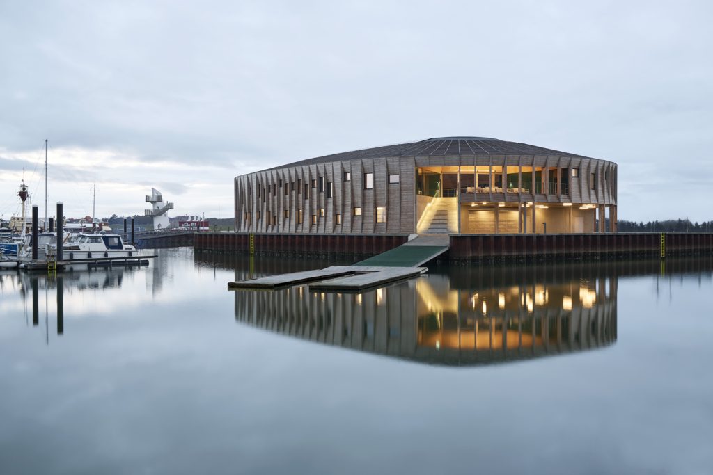
In the seaport town Esbjerg on the Danish west coast, a new maritime center has opened to the public. Developed by WERK Arkitekter and Snøhetta, following a design competition in 2019, the center is created as a shared space for watersport clubs and visitors along the port, providing the town with a social maritime hub and architectural landmark. Esbjerg’s new Maritime Center, dubbed “The Lantern”, is designed to put the community first. Housing multiple watersport clubs, boat storage, training facilities, a large workshop space and social functions, the center is a true hub for maritime activities. Its circular, open design invites visitors in from every angle, creating an accessible and inclusive building. “The goal has been to create a unique destination that lights up the Danish West Coast, so everyone can find their way to new communities at the sea” says Thomas Kock, Creative Director at WERK Arkitekter. Read the full article here
Factory International Aviva Studios / OMA
- Architect: OMA
- Place: Manchester, Regno Unito
- Photographer: Marco Cappelletti
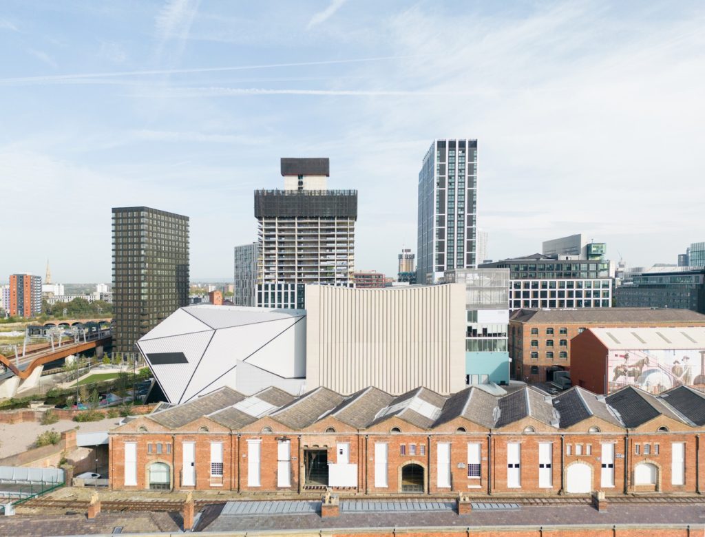
Since it was launched in 2007, the Manchester International Festival, a biennial international art festival organized by Factory International, has taken place in existing buildings both large and small throughout the city. But spaces with the qualities needed by the art pieces commissioned by the Festival are fewer and fewer, disappearing amid Manchester’s fast-paced redevelopment into England’s new economic hub. In 2015 Manchester City Council launched an architecture competition for a new kind of art venue for the Manchester International Festival capable of hosting both art performances and exhibitions, separately or simultaneously. The competition was won by the architectural firm OMA, and the project has finally been completed. The Factory is not one building but two. Its main event space, the Warehouse, is one large, 21-meter tall, flexible container, left bare to be adapted by its users as they see fit. It can be used as a single space or subdivided into two, with full-height moveable partitions that provide acoustic insulation. Productions of different scales can take place inside, from intimate performances to concerts with 5,000 people standing. The ceiling is a technical grid, with lighting, equipment, and rigging, that supports concerts and exhibitions alike. Read the full article here
Simba Vision Montessori School / Architectural Pioneering Consultants
- Architect: Architectural Pioneering Consultants
- Place: Ngare Nanyuki, Tanzania
- Photographer: Nadia Christ, Benjamin Stähli
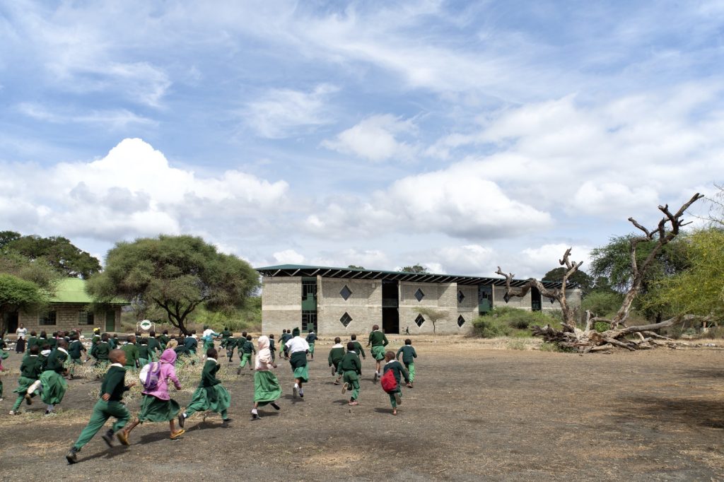
The remote location of the site and the ambition to operate with an ecologically low impact led to a simple block wall construction, which consists of volcanic rock and sand, naturally available on-site in an ideal mix. The blocks consist of only 10% of cement, and the walls are constructed without the need for additional reinforcement. Interior spaces are partly clad with straw and mud to improve comfort and acoustics, a technique traditionally carried out by Maasai women. The use of steel is reserved for the roof, which acts as a sunshade and rainwater harvester. The mild year-round climate allows for the building to operate without mechanical cooling or heating and with a minimum of artificial but activity-based lighting. A combination of natural ventilation, sun shading, and thermal mass ensures thermal comfort. Read the full article here
Science and Innovation Center VIZIUM / Audrius Ambrasas Architects
- Architect: Audrius Ambrasas Architects
- Place: Ventspils, Latvia
- Photographer: Norbert Tukaj
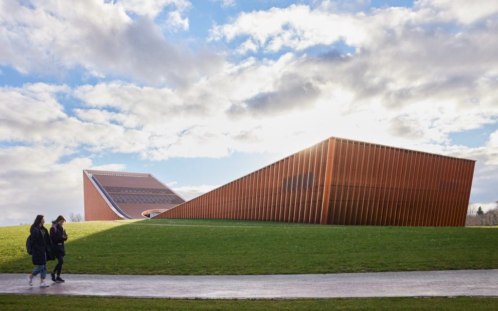
Science and Innovation Centre in Ventspils was designed as a union of architecture and landscape. Instead of proposing a landmark on the bridge axis, we leave it open and inviting. The silhouettes of the building and the hill osculate here. New public spaces such as the science hill mounting up from the plain, an open-air roof terrace and an overlook spot are designed for both the locals and city guests. The building design divides the site in two. The Western part accommodates vehicle access and parking, while the technical transport access is separated from the arrival of visitors – it gets to the building from the South. The Eastern part of the site is shaped by the hill, which is a place for picnics and open-air events, providing views of the river. The hill leads to the roof terrace with access to the public facilities (café, conference hall, and access to the main lobby) zone on the first floor. Read the full article here
Laguna / Productora
- Architect: PRODUCTORA
- Place: Colonia Doctores, Mexico City
- Photographer: Arturo Arrieta, Camila Cossio
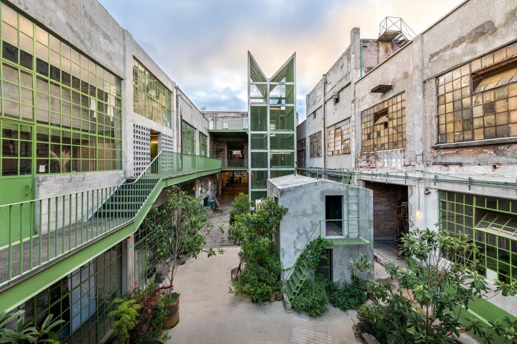
La Laguna is a former textile and yarn factory built in the 1920s in Mexico City’s Doctores neighborhood. The design involves the deteriorated factory’s recovery and enhancement into the vibrant complex that currently houses more than 25 motley creative and productive firms including carpentry and textile workshops, coffee brewers, and ceramics studios, among others. Although the historic building is not cataloged, the intervention project proposes to preserve the original exterior facades and focus on the interior courtyards that had accumulated a large amount of equipment, roofs, and annexes over time, losing its function as a spatial connector between the different areas of the complex. The reconversion strategy was designed to be implemented gradually, over the course of several years (more than ten years), and with a flexible group of tenants using the complex simultaneously. Read the full article here
Qujiang Museum of Fine Arts Extension / Neri&Hu Design and Research Office
- Architect: Neri&Hu
- Place: Xi’An, China
- Photographer: STUDIO FANG, Runzi Zhu
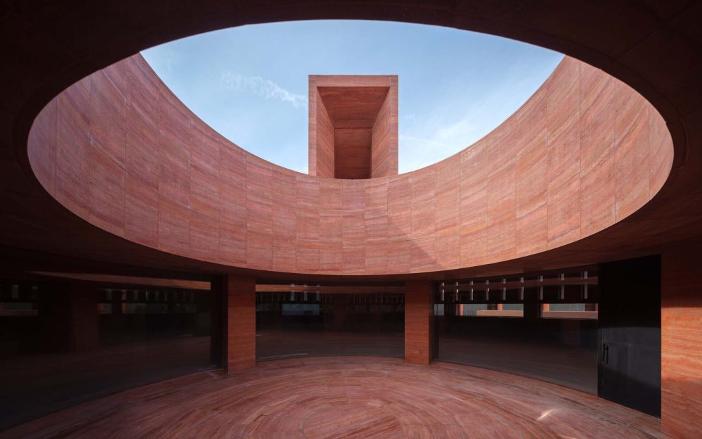
The Qujiang Museum of Fine Arts is located at the beginning section of Xi’an’s Datang Everbright City, south of the famed Giant Wild Goose Pagoda. The client asked for a new architectural icon at the East Entry of the museum. In response to the brief, Neri&Hu’s proposal takes the idea of a monolithic urban monument as the guiding concept to not only satisfy the museum’s newly expanded cultural and commercial functions but to also serve as an anchor and a durable symbol of social history for the surrounding urban fabric. Since the vicinity of the site is occupied by existing galleries, the design intervention minimizes the impact of the new building through careful consideration of the architectural massing and detailing.
Chon Buri / Funs Design
- Architect: Funs Design
- Place: GaoZhuang, Xishuangbanna, China
- Photographer: © Yu Photography
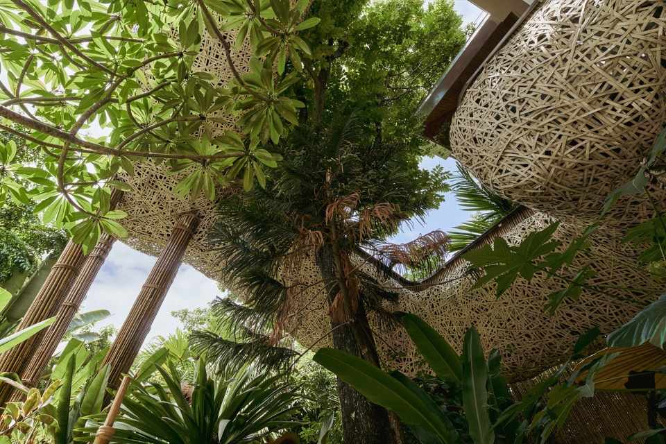
The best architecture is the one that allows us to be deeply immersed in nature and not to know where the latter ends and art begins. With these words the designers of the Chengdu-located firm Funs Design begin to write about their latest Chon Buri project, completed in the first months of 2023 and located in the GaoZhuang district, in the autonomous prefecture of Xishuangbanna, south-west of China, historic homeland of the Dai ethnic group. Placed in the heart of this fertile land, which has nurtured a wealth of cultural and architectural traditions and natural marvels, the 1,700 sqm project consists of two distinct structures – one housing a restaurant and the other a spa center – divided by a central promenade, which provides the right sense of privacy to both.
The Museum of Art and Photography Bangalore / Mathew and Ghosh Architects
- Architect: Mathew & Ghosh Architect
- Place: Bangalore, India
- Photographer: Iwan Baan
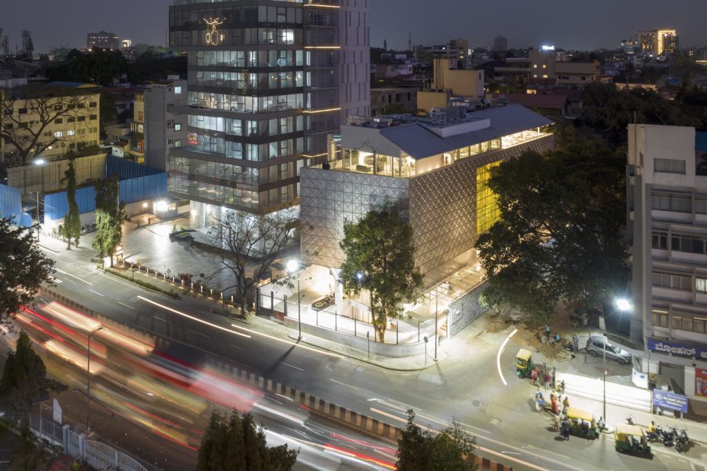
MAP Museum of Arts & Photography, South India’s first major new art museum to open in a decade, opened to the public in Bengaluru on February. Bengaluru, the largest city of the southern Indian state of Karnataka and the country’s technology capital, has experienced an important growth in the artistic production in recent decades, which has led to the opening of several private ateliers and to the creation of the public National Gallery of Modern Art in 2009 and of the first digital version of the MAP in 2020. Designed by the local firm Mathew & Ghosh Architects, under the supervision of a commission of experts led by Rahul Mehrotra, the modern complex of over 4,000 square meters houses in four large galleries an outstanding collection of over 60,000 artworks, whose nucleus is formed by the donations from its founder, the philanthropist and collector Abhishek Poddar. The eclectic collection is divided into six sections: Pre-Modern, Modern and Contemporary, Photography, Living Traditions, Popular Culture and Textiles, Craft & Design. The museum’s mission is to take its heritage of artworks, textiles and photographs, which offer an extraordinary insight into Indian art and culture, to the heart of the community, making it accessible to a diverse audience. Since MAP is considered as a cultural beacon for both city dwellers and visitors and as a space for ideas and conversations, it – as architect Soumitro Ghosh explains – required a simple planning, a historically rooted architectural gesture and an use of material that balances its transparency, associated with its public function, with the opacity of the spaces for the conservation and protection of the artworks.
