Braiding a new design culture / Izaskun Chinchilla Moreno for IQD
In the section “Textile Architecture” curated by Benedetta Tagliabue in issue 69 of IQD, architect Izaskun Chinchilla Moreno, who specializes in design with recycled, repurposed or creatively reused materials, through the narration of some of her works – House in Carmena, the pop-up installation Organic Growth, the renovation and recovery of the Castillo de Garcimuñoz and the Utopicus Clementina Cowork project – expresses her architectural vision.
House in Carmena
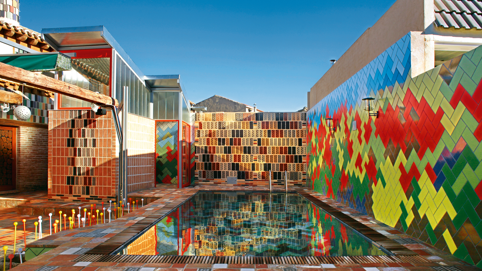
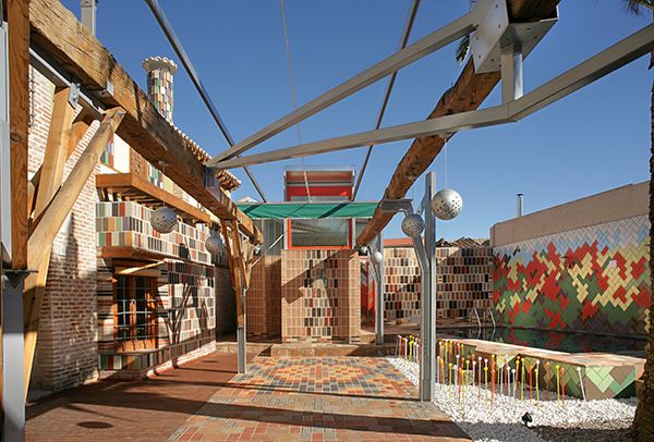
Regardless of their location, size and period of construction, ancestral houses show the traces of the families who have lived in; they reflect and represent, visually and architecturally, their tastes and habits. The House in Carmena, in the Spanish province of Toledo, is no exception. The refurbishment of this 374 sqm house takes as its starting point the challenge of transforming an existing architecture, while critically recovering the good customs of the past and blending them with the contemporary ways of living. The design rejects as absolute value that need for historical legibility in interventions on architectural heritage associated to the Athens Charter, above all when this affects the activity of users or forces to undertake a structural cleansing which takes away the warmth that for many people a house must have.
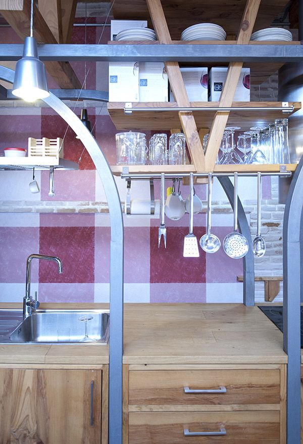
As a consequence, all figurative aspects, finishes and details that in some way contribute to the well-being of the residents have been preserved and reinterpreted with a critical and open gaze. Old materials allowed building new structures, with greater span and capacity, whereas the new materials have been braided to evoke ancestral woodworking and carvings. Moreover, turning time into the project’s best ally, in almost all cases the used material comes from demolitions. The two-story house is organized around an open courtyard with swimming pool and sauna, which is accessed via a gate made out of recycled pieces of wood and metal. Here, an explosion of colors and shapes is linked to the use of ceramic material, both in the flooring and in the walls. Inside, the lower floor houses the public program, while the upper floor accommodates the bedrooms and more private spaces.

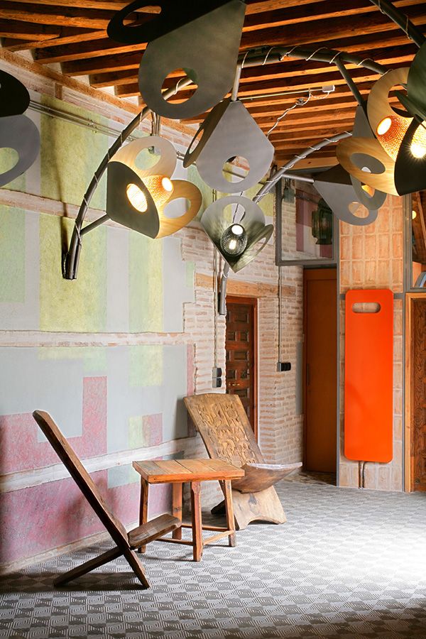
Photo: © Carlos Lozano 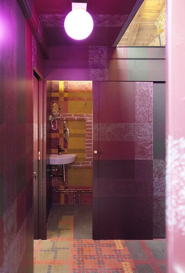
Photo: © Carlos Lozano
Organic Growth
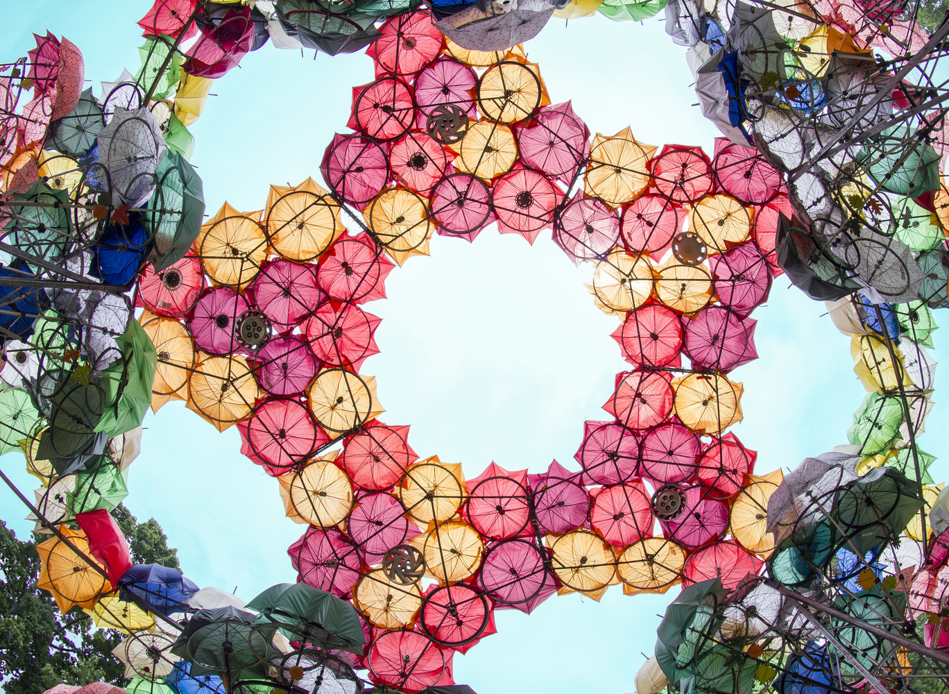
An extraordinary mix of colors, shapes and recycled materials also characterizes the Organic Growth popup installation, set up in 2015 in New York for the City of Dreams Pavilion competition. An almost 5 m high installation stating that the city of the future will have learnt further lessons from nature. The inspiration came from natural structures, in particular from the morphology of hydrangeas, which grow up and down to adapt to the space and time circumstances. Hydrangea macrophylla, simply known as hydrangea, has large globular flowers that resemble domes; their number in a plant depends on several factors, such as age, orientation, humidity, light or quality of the soil. Ultimately, it grows keeping a good balance with the environment. Shouldn’t it be what a City of Dreams does? Architecture has to learn from the philosophy of an organic growth: it is crucial to keep ideas flexible so that they can adapt to real needs. Learning from nature helps taking care of human well-being.
All the pieces used in Organic Growth are recycled and come from ecosustainable productions. Its branches, formed by broken umbrellas, old stools, tripods or crashed bicycle wheels, could then have easily been reused as sun, wind and rain protectors in windows, terraces or outdoor spaces all around the city and the bigger elements transformed into indoor chandeliers. All elements could be useful for community centers or NGOs. The work, through an immersive experience, attracted the interest of visitors on the design approach known as from the cradle to the cradle – as opposed to the from the cradle to the grave, which indicates the methods of analysis of the life cycle of a product – which consists in adapting industry models to nature, or rather in converting the production processes by assimilating the used materials to the regeneration process of the natural elements.
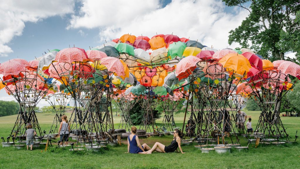
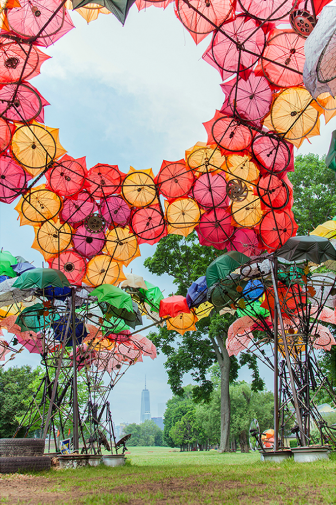
Photo: © Sergio Reyes 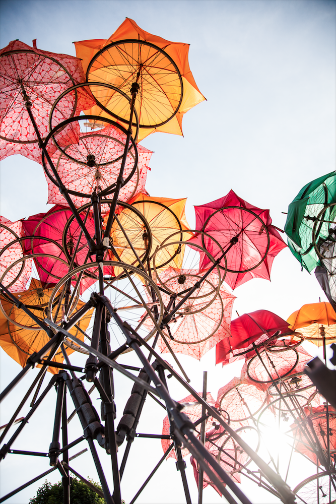
Photo: © Sergio Reyes
The Castillo de Garcimuñoz
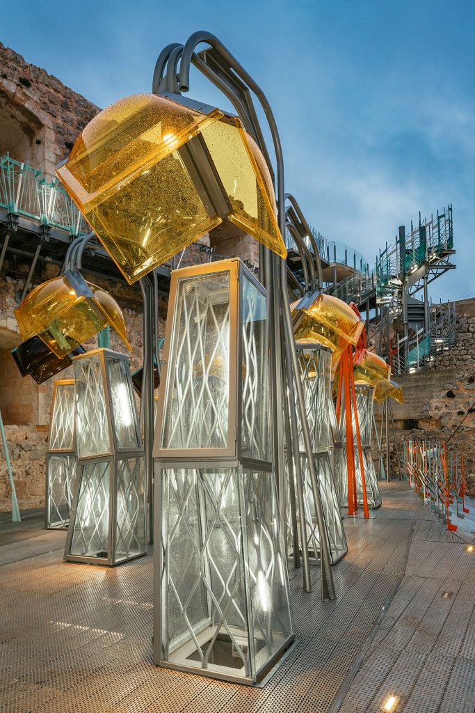
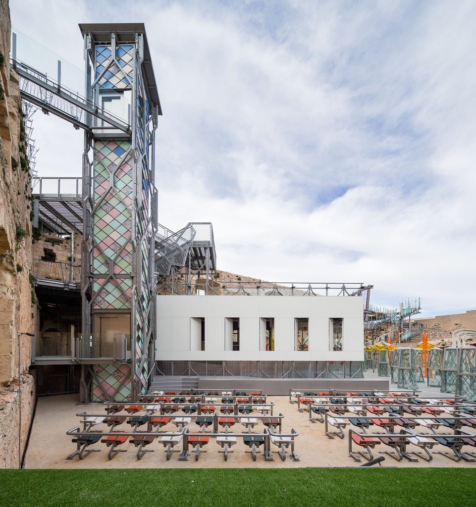
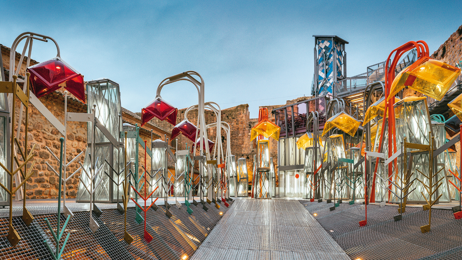
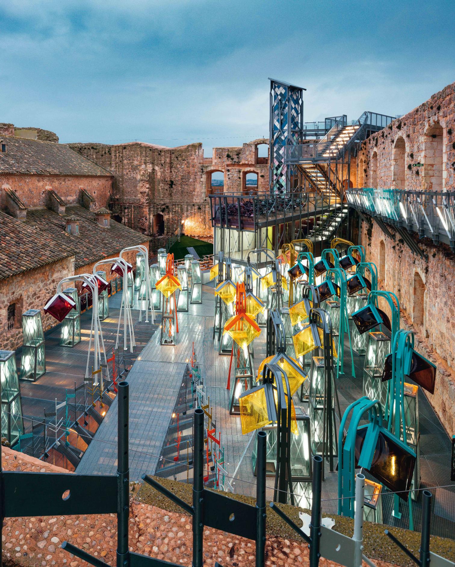
The castle of Castillo de Garcimuñoz, a very small Spanish municipality in the autonomous community of Castilla-La Mancha, in the Province of Cuenca, is a stratification of construction elements dating back to different eras, from the 12th century, era of the remains of a Moorish citadel, to the 18th century. Different eras, several construction techniques, demolitions, additions and the lack of coordination made it difficult to interpret the historical data and, as a consequence, to visit and understand this important complex. These considerations led in 2016 to the refurbishment of the castle and to the introduction of new uses, such as an openair cinema, spaces for temporary exhibitions and a library, in order to guarantee both the physical conservation of the complex and its social utility. One of the key points of the project was to conceive it as an orthographic system, in which the new architectural elements are small and lightweight like dots and commas in a text, yet their placement is essential for understanding the intricate historical heritage.
Different strategies and groups of materials made it possible to perceptually separate elements belonging to different eras, contributing to a better understanding of historical data. The new elements can all be easily dismantled and replaced, thus allowing the project to be reversible and the complex to be able to incorporate other uses and digital transformations in the future. The lower level, where the ancient ruins of a Muslim citadel are located, is covered by a pedestrian platform, composed of a glass layer and a steel grid, which allows the complex to benefit from the greenhouse effect in winter. On the platform there are some solar chimneys that reduce the heat in summer and act as display cabinets for museum purposes. The extensive use of galvanized steel, the systematic removal of welding joints and the application of surface treatments that guarantee transpiration and longevity of all materials also minimize the maintenance costs. Another consideration that influenced the design choices relates the limited resources of the small municipality of Castillo de Garcimuñoz, which has less than 200 inhabitants, for the maintenance.
Resources that partly come from the high influx of visitors, especially in the summer season, fostered by the location along the expressway Madrid-Valencia. This led to the decision to reduce the spaces with energy requirements and to adapt them to different uses throughout the year. Most of the usable space is used for a period of 8/9 months and, according to the principles of bioclimatic architecture, only when good weather and the adopted passive strategies allow it. The used cultural spaces, which reach up to 2,000 square meters in summer, are reduced to no more than 250 square meters in winter, with a significant reduction in management and energy costs.


Photos © Miguel de Guzmán 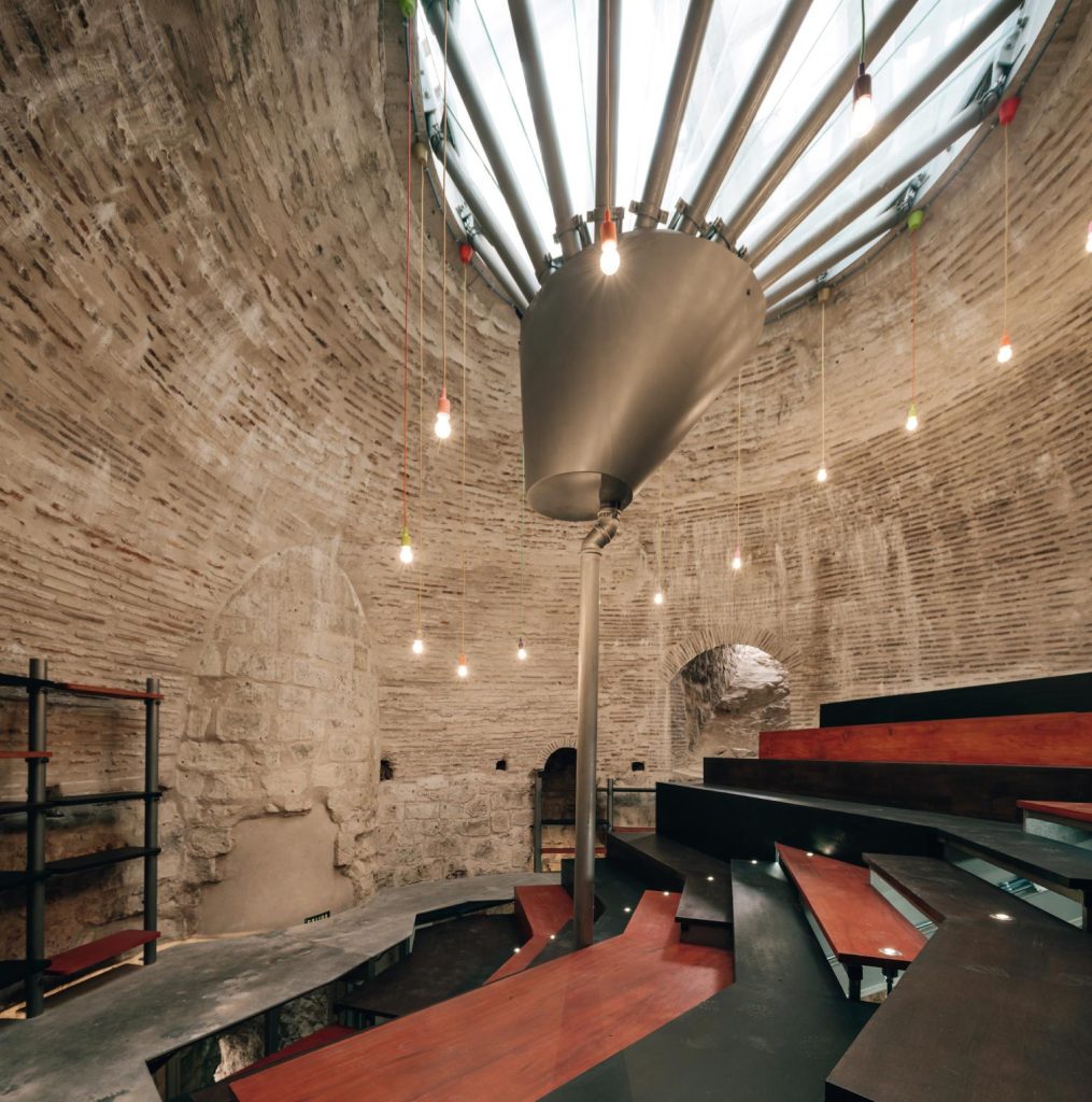
Photos © Miguel de Guzmán
Utopicus Clementina Cowork
Until the 18th century, Gràcia neighborhood was a rural town articulated by masías, typical Catalonian rural housing, religious convents, and high-society manor houses. From the 19th century, with the Second Industrial Revolution and the destruction of Barcelona’s medieval walls, the neighborhood became key to the urbanistic expansion of the city. All ancient cultivation fields became terrain to construct and install new industries. Paseo de Gràcia, being the bourgeoisie’s favorite Sunday walk path, soon propelled Vila de Gràcia to be permanently annexed to Barcelona in 1897. Despite the new industries, the neighborhood maintained its rural character for about two centuries, and today, highly rural fountains, patios, houses, and buildings serve as evidence of its past as a small semi-agricultural municipality. In addition to its rural essence, Gràcia contains a Modernist patrimony of great interest. It extends all the way from Lesseps until Jardinets, passing through the Rambla del Prat or Calle de les Carolines. There exist buildings little known to the vast majority, filled with undeniable beauty and uniqueness.
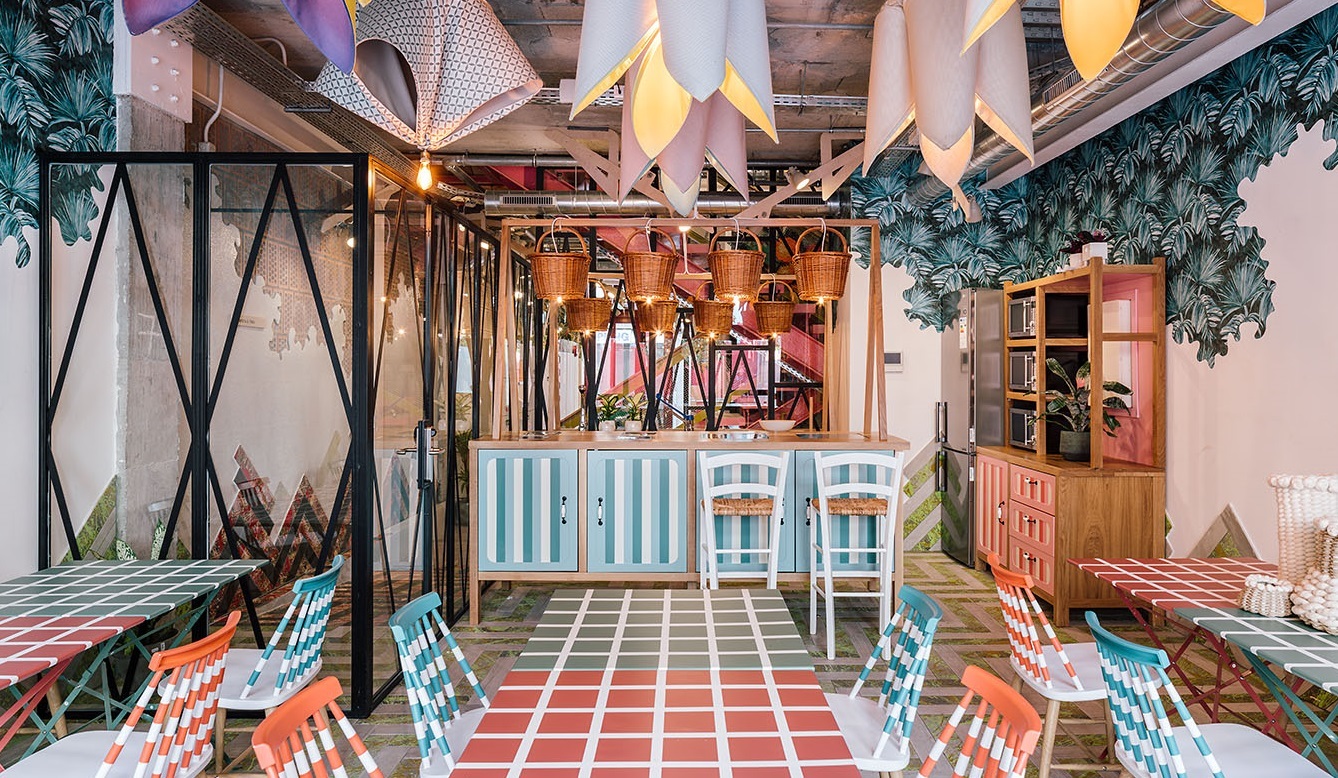
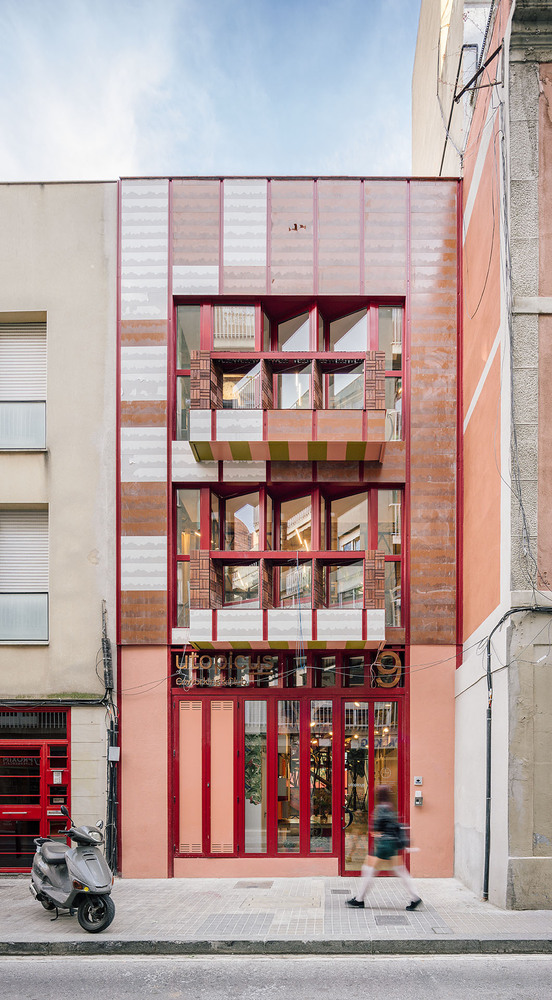
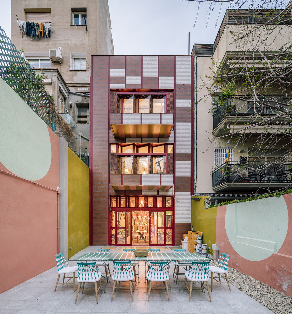
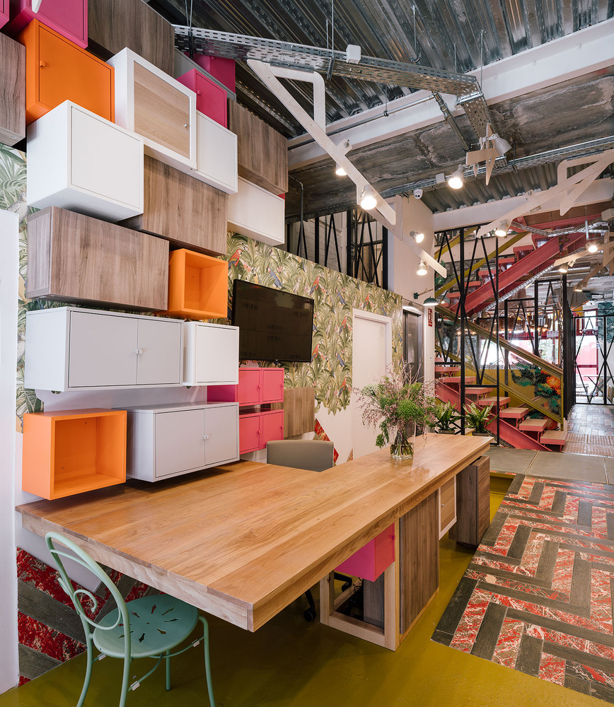
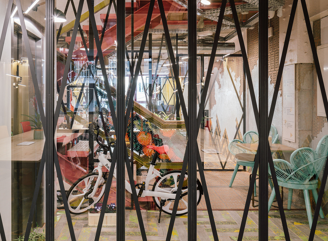
Here there is the repaired Casa Vicens, a UNESCO world heritage, designed by Antoni Gaudí. Casa Vicens, built between 1883 and 1885, is considered the architect’s first full construction. Here Gaudí brought the rich nature of the adjoining garden inside the house, reproducing it on the ceilings and walls and creating a close relationship between internal and external spaces. The house shows a varied range of ceramic handcraft. The project of the new 384 sqm coworking space designed for Utopicus, the leading Spanish company in the management of flexible workspaces, is located in this neighborhood and was therefore inspired by its rural preexistence and its modernist architecture, particularly by Casa Vicens. One of the most evident footprints linked to this inspiration are the ceramic traces scattered throughout the façade and the interiors. Modern, ecological and easy-to-maintain ceramics, that have however maintained a great artisanal quality. Pieces of natural aspect have been collected, many times in clay-colored tones that resemble their raw origins. As well, semi-vitrified protections have been applied, making resemblance to the artisan workforce and ceramics fabricated when Gràcia was annexed to Barcelona.
Natural inspiration in the interior spaces is another aspect that links the coworking space to its context. Illumination, electrical cables, railing, wall finishes, and way-finding techniques are inspired by the geometry, color, and material logic of trees. However, this connection to nature is not just limited to visual similarities: the overall design has kept high sustainability standards as one of its principal priorities. Many solar panels and passive ventilation techniques have been implemented, drastically lowering energetic requirements with the need of less local electricity and airconditioning. The wide crystal skylight and a solar chimney also guarantee natural form of air renovation without much noise-pollution. All these elements, alongside the building’s small scale, provide a unique interior atmosphere: relaxed, cozy, and naturalistic. The garden, facing south in a shared courtyard, is graced by a fragrant Citrus Clementina, that gives its name to the project. The project is dedicated to those who believe that understanding innovation also requires a return to the roots of what we once were as a community and culture.


Photos © Miguel de Guzmán 
Photos © Miguel de Guzmán
