16 projects selected for the RIBA International Awards for Excellence 2021
The Royal Institute of British Architects (RIBA) has revealed the 16 winners for the RIBA International Awards for Excellence 2021, the major biennial awards given to architectural projects considered significant and inspiring for their design excellence, architectural ambition and social impact.
“It is especially important to consider excellence in architecture at this time, in this rapidly changing world, where governments, clients and society need the skills and insights of architects. Our awards show how well-considered, well-executed architecture has the immense potential to improve lives and communities” said Alan Jones the RIBA president.
The 16 projects, selected following a site visit by a RIBA – appointed local delegate and a rigorous judging process, are spread across 11 countries – the only country excluded from nomination is the United Kingdom, a decision prompted by the fact that RIBA awards the Stirling Prize to buildings in the UK – and include large urban masterplans, cultural centers, hospitals, memorials and private residences. The winner will be announced in November.
Explore the 16 winning projects below.
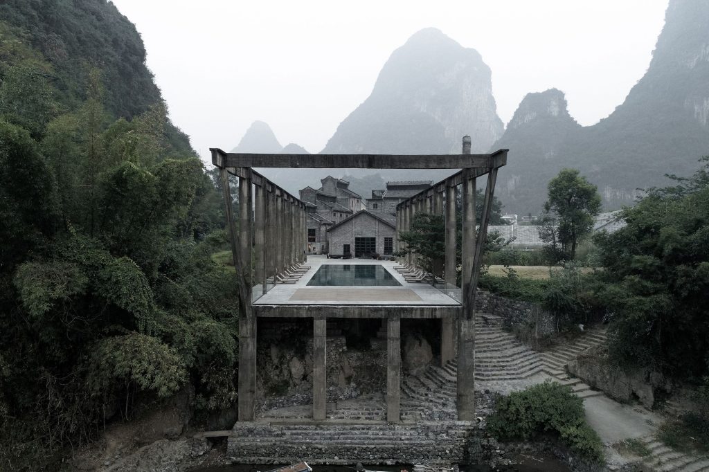
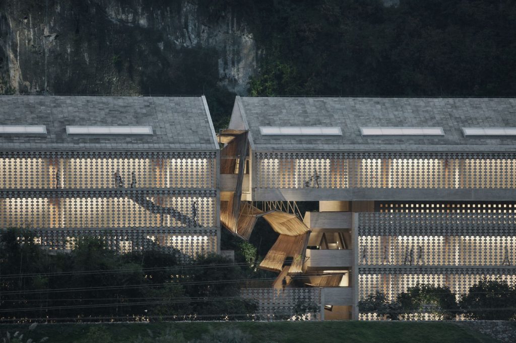
1. Alila Yangshuo by Vector Architects / China
Located on the banks of the River Li and at the base of the karst mountains in the Chinese district of Yangshuo, Guangxi, the transformation of a former sugarcane mill building built in 1972 and its surrounding, long since abandoned industrial landscape, has created a beautiful new hotel complex in this ecologically protected setting. Vector Architects conserved the layout of the old sugar mill: the crane truss used to transport raw sugarcane from the river, and the refining workshop where the syrup flowed to the next building for extraction. Between these restored structures, now housing shared facilities for residents, new elements of landscape: a sunken plaza, reflecting pond and series of planted courtyards have been inserted.
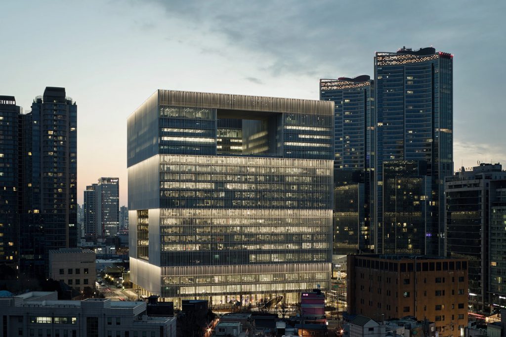
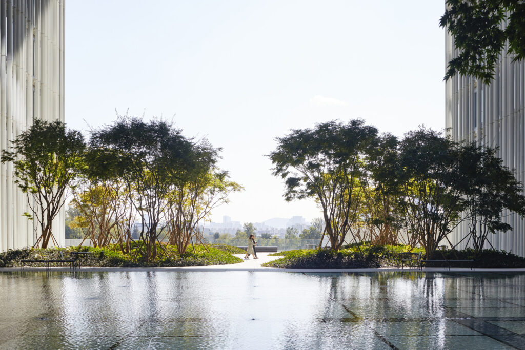
2. Amorepacific Headquarters by David Chipperfield Architects Berlin / South Korea
The building designed to house the headquarters of the Korean company AmorePacific is made up of a single volume, developed around a central courtyard to maximize the effectiveness of natural ventilation and daylight. Three large openings, located on different levels, connect this central void with the exterior surroundings and provide panoramic views over the city and the mountains in the distance. The openings, in addition to characterizing the morphological-dimensional aspect of the volume, allow nature, thanks to the presence of some hanging gardens, to extend from the adjacent park into the building. By elevating the external brise-soleil cladding of the façade to the first level, the entrance level opens up to the city, drawing the public into a generous atrium and further to the central courtyard situated above. This area, with its artistic installations and its gardens, represents the communal heart of the company building, providing the visitors with a series of cultural and recreational spaces. The company working areas are located at the upper levels.
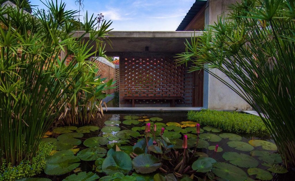
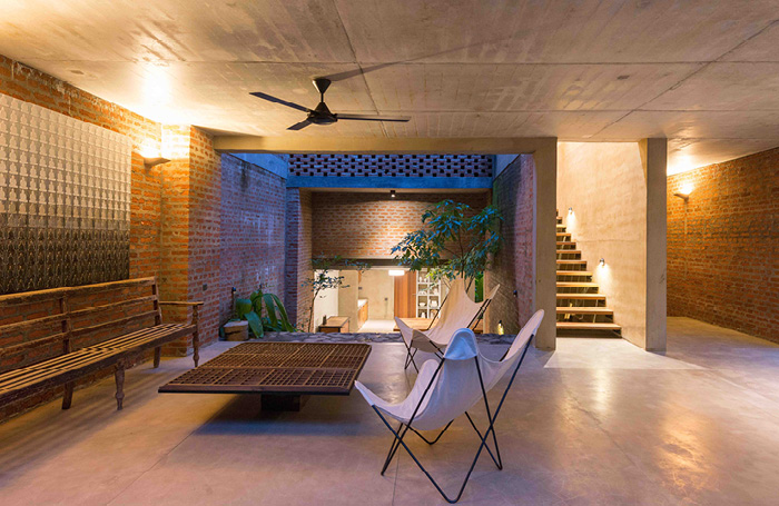
3. Artists’ Retreat at Pittugala by Palinda Kannangara Architects / Sri Lanka
Designed as a home and studio for a Sri Lankan painter and his family, the artists’ retreat is situated in the periphery of the dense city of Colombo, and is the result of a close collaborative process between the architect: Palinda Kannangara, the client and local crafts people. The concept was to create a low budget, handcrafted home and studio, with open, landscaped garden spaces woven into the form and fabric of the building – in essence, to create a private oasis and a “home which feels like a garden.”
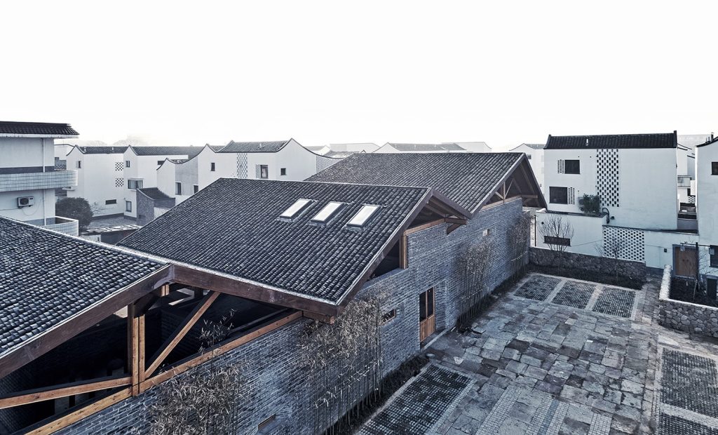
4. Dongziguan Villagers’ Activity Center by gad · line+ studio / China
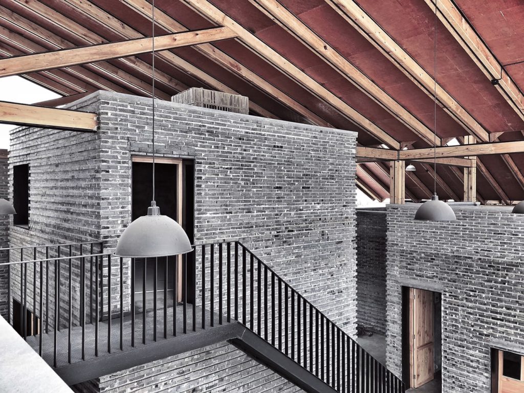
Dongziguan Villagers’ Activity Centre is a modest community building that serves a large development of new housing which is also by the same architects. The images and drawings of the Villagers’ Activity Centre clearly illustrate both a strong architectural intention and an ambition to create a building that encourages public engagement and a sense of community. The idea is explicit, a collection of individual brick walled community rooms are loosely covered by an over-sailing, timber structured, terracotta tiled roof. The spaces between the rooms although sheltered by the roof are open to the pedestrian lanes that connect the building into the greater masterplan. Indeed the building invites these public routes to percolate through it. The brief for both room and route is open and capable of change, accommodating uses such as market, community rooms, games room and library.
5. Expansion of the University Hospital of the Santa Fe de Bogotá Foundation by El Equipo Mazzanti, Giancarlo Mazzanti / Colombia
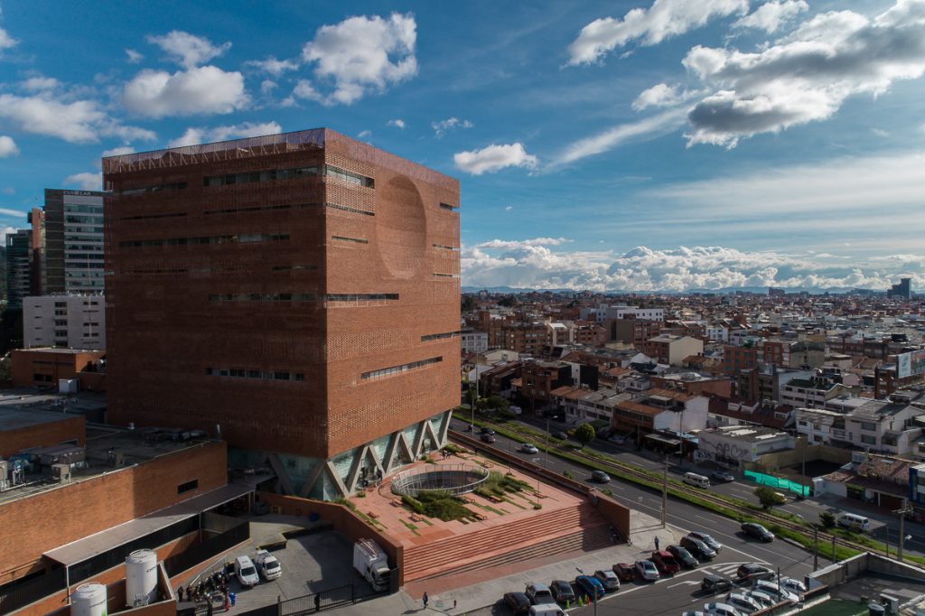
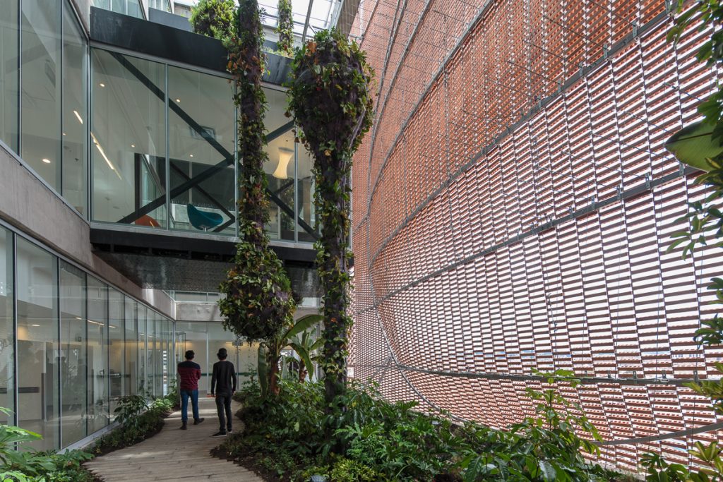
The building was conceived as an expansion of the existing Santa Fe Hospital, a strong institution that seeks welfare through medical and scientific innovation as well as its patient-oriented attention. The project was expected to complement and renew several facilities within the medical center, while consolidating an iconic image for the institution. The project’s key location – between two of Bogota’s main avenues – meant that it had to perform as an urban connector, a catalyzer for new activities and human relationships, while keeping in touch with the medical center’s architectural language: a complex of modern, brick-clad buildings. The new building had to be able of dialoguing with the existing complex not only on a functional level, but also on a representational plane: through its materiality. Given the requirement for continuity throughout the whole medical center, the building adopts a brick membrane façade: a contemporary reading of the traditional masonry system that characterizes the previous buildings. Indeed, the whole building is based upon the premise that space itself can fasten healing times, light up patients’ moods, and thus improve the recovery process. The façade itself not only works as a representational element, but as an intricately configurable membrane that regulates the amount of sunlight that penetrates each space. But mainly, this brick skin allows for a greater relationship between the patients and the outside world, assuring maximum openness for the rooms, while ensuring privacy where else needed.
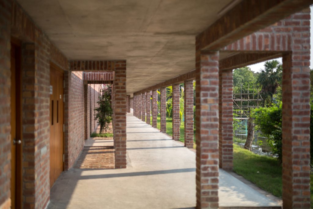
6. Friendship Hospital, Satkhira by Kashef Chowdhury/URBANA / Bangladesh
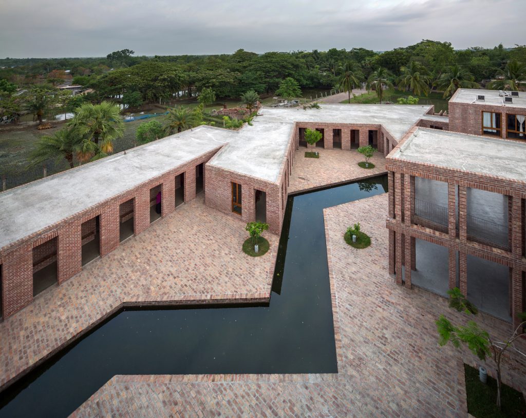
The hospital is situated in a predominantly rural area that had been heavily affected by a major cyclone just a few years ago. In this natural, nature-ravaged landscape, thinly marked with low-rise structures and thatched houses, a local philanthropist donated land for Friendship to build an eighty-bed hospital. Inspired by a powerful abstraction of the riverine Bengal landscape, the campus blends with the surroundings. The building layout is efficient and the architecture rational. A series of courtyards bring in natural ventilation towards, while air-conditioned spaces such as operating rooms are placed in areas in the wind shadow. The penetration of direct and reflected sunlight into all wards and consulting rooms was studied in detail.
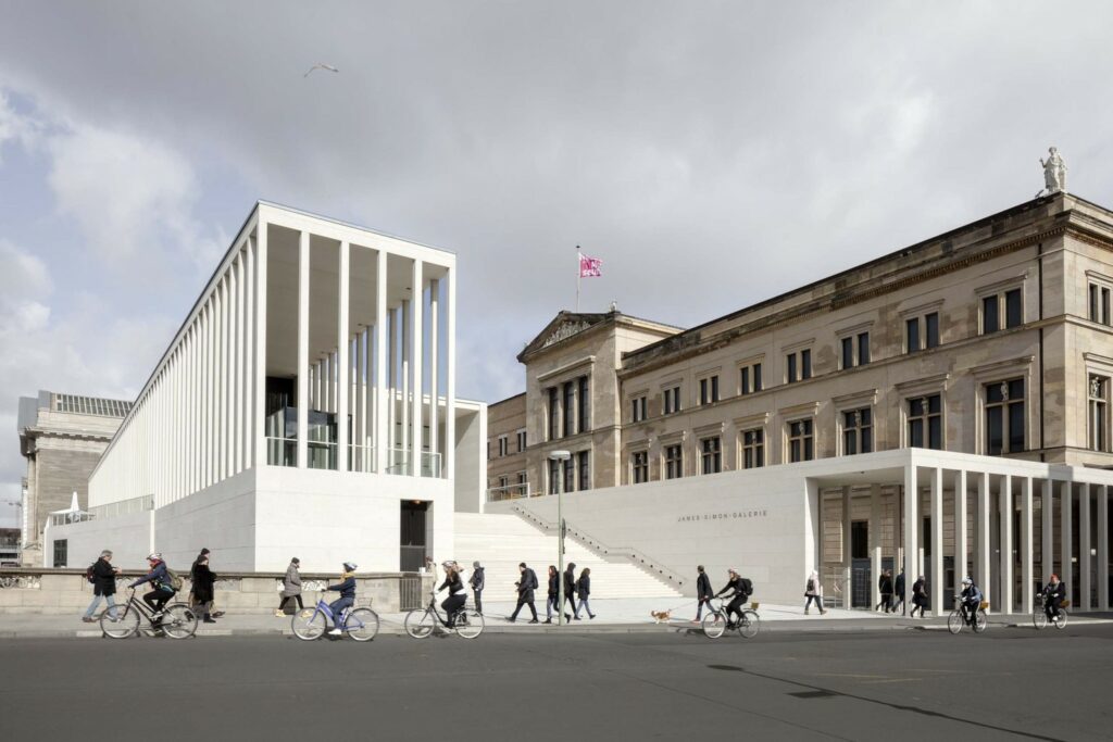
7. James-Simon-Galerie by David Chipperfield Architects Berlin / Germany
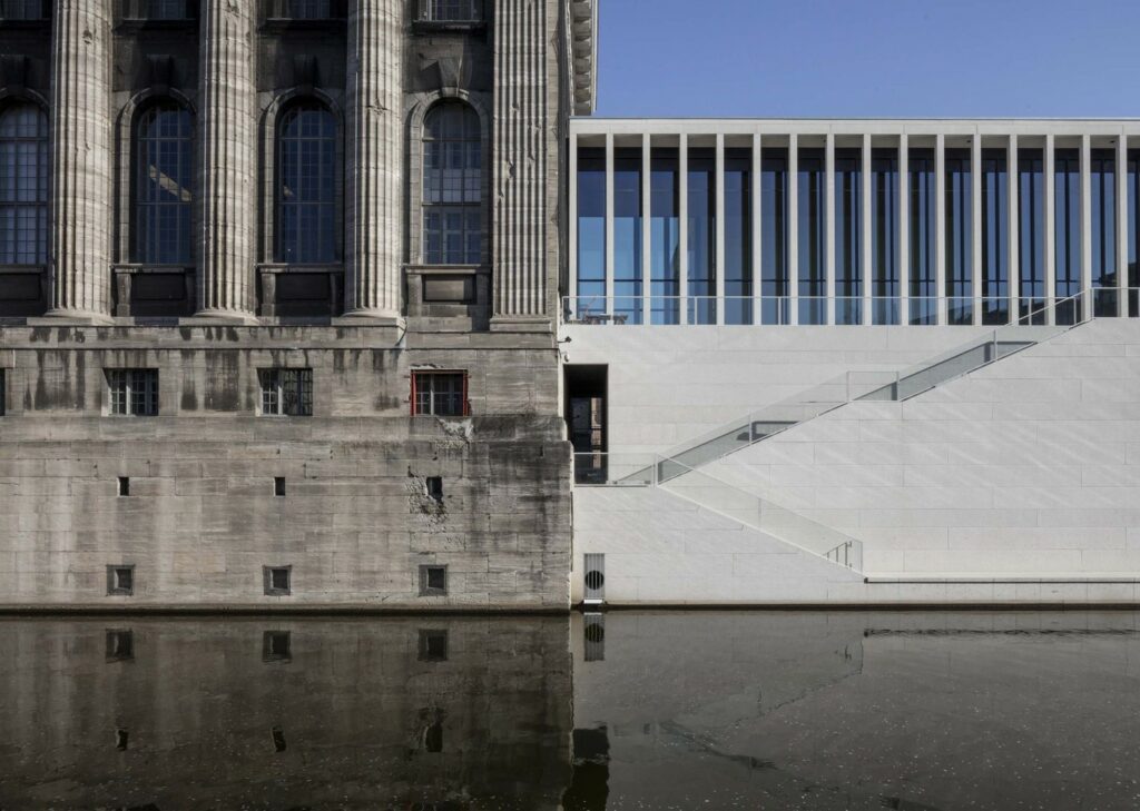
The new building that serves as entrance to the Berlin’s Museum Island is named after James Henri Simon, the Jewish entrepreneur and philanthropist who donated, before his death, most of his significant art collections to the Berlin State Museums. The James Simon Galerie, designed by the Berlin office of David Chipperfield Architects, which houses a cafeteria, the welcome facilities such as a large cloakroom, toilet facilities and lockers, a 300-seat auditorium and some temporary exhibition spaces, represents the backbone of the Island’s masterplan that was also developed by Chipperfield in 1999. Its role – Chipperfield said – is not so much defined by its function but rather by its responsibility as a public building at the heart of the city. Just as the architectural language of the new James Simon Galerie refers, in the colonnade and in the staircase, to the stylistic code of the architects involved, like Karl Friedrich Schinkel and Friedrich August Stüler, in the design of the buildings of the Museum Island, the materiality of the building, dominated by smooth in-situ concrete in its interior spaces, finds its classical soul in the external façades in reconstructed stone with natural stone aggregates which blends with the rich palette of the materials used, in particular with the limestone and the sandstones.
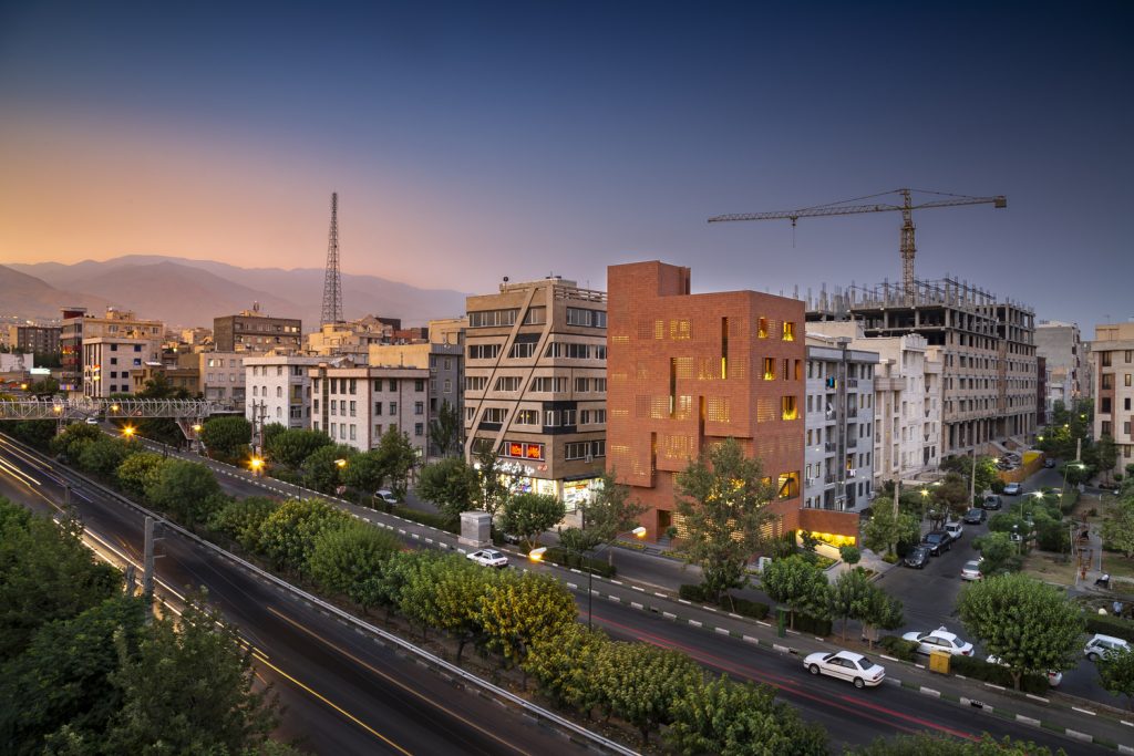
8. Kohan Ceram Central Office Building by Hooba Design Group / Iran
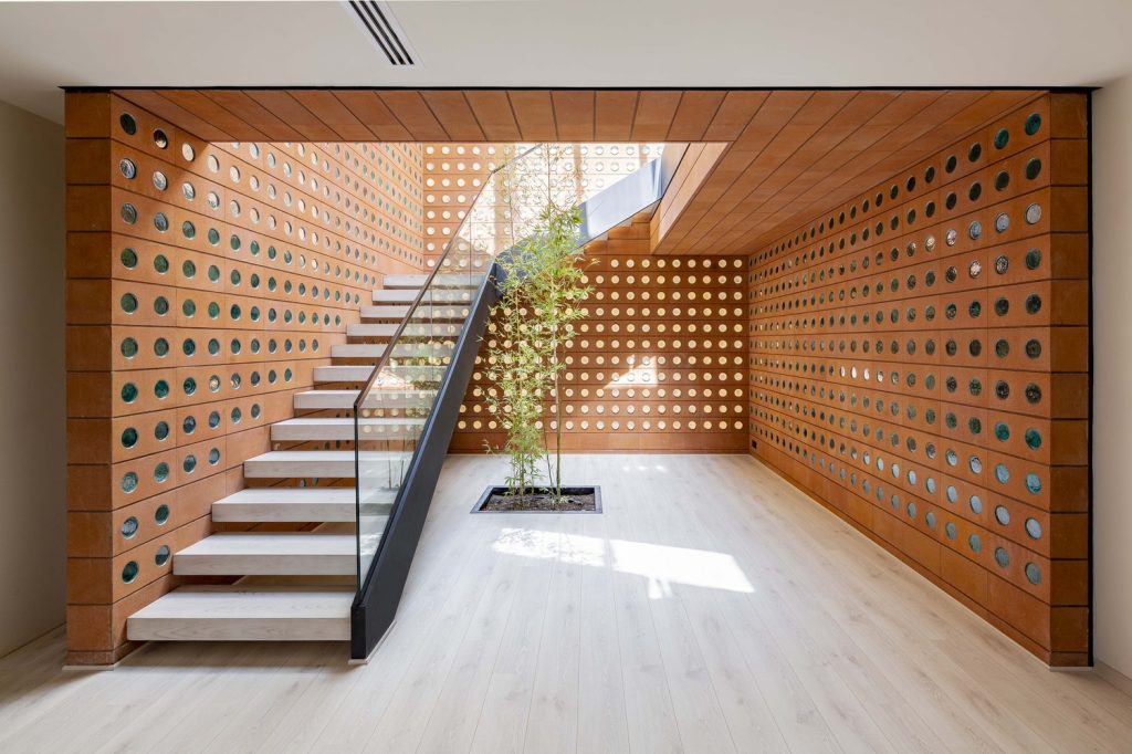
Situated alongside Sattari expressway in Tehran, it marks the western boundary of a residential neighbourhood. It was designed as the headquarters for Kohan Ceram Brick Manufacturing Company, containing its car park, showroom and sales office, as well as a residential unit. But it could be adapted to house one use or a number of different uses, connected on many levels. This challenges the local norm where floor levels are single height volumes. The organisation of spaces and voids in a naturally ventilated environment with controlled but generous daylight makes this an uplifting and aspiring design to enjoy and use. An existing concrete structure was reused. Otherwise, the external and internal structure is made of perforated bricks, designed by the architect and made by Kohan Ceram. The approach was to use a single material to create both the whole and all the parts.
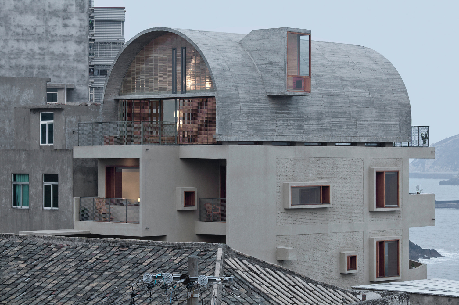
9. Renovation of the Captain’s House by Vector Architects / China
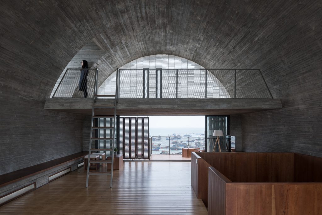
The Captain’s House is a beautiful example of how a small project with modest ambitions has the ability to impact a community. The unlikely outcome of a Chinese reality television show, The Captain’s House is a refurbishment and extension of an existing ship’s captain’s house poised on the water’s edge overlooking the East China Sea in Beijiao Village, at the southeast end of Huangqi Peninsula, Fujian Province, China. What began as the creation of a modern family home, expanded to include an outreach and gathering space which welcomed in the people of the village, creating a new and unusual building typology supporting both domestic and community use. The building is a three-storey structure with a distinctive ‘floating’ barrel-vaulted roof, knitted into the tight grain of historic streets of the village.

10. Lianzhou Museum of Photography by O-office Architects/Jianxiang He & Ying Jiang / China
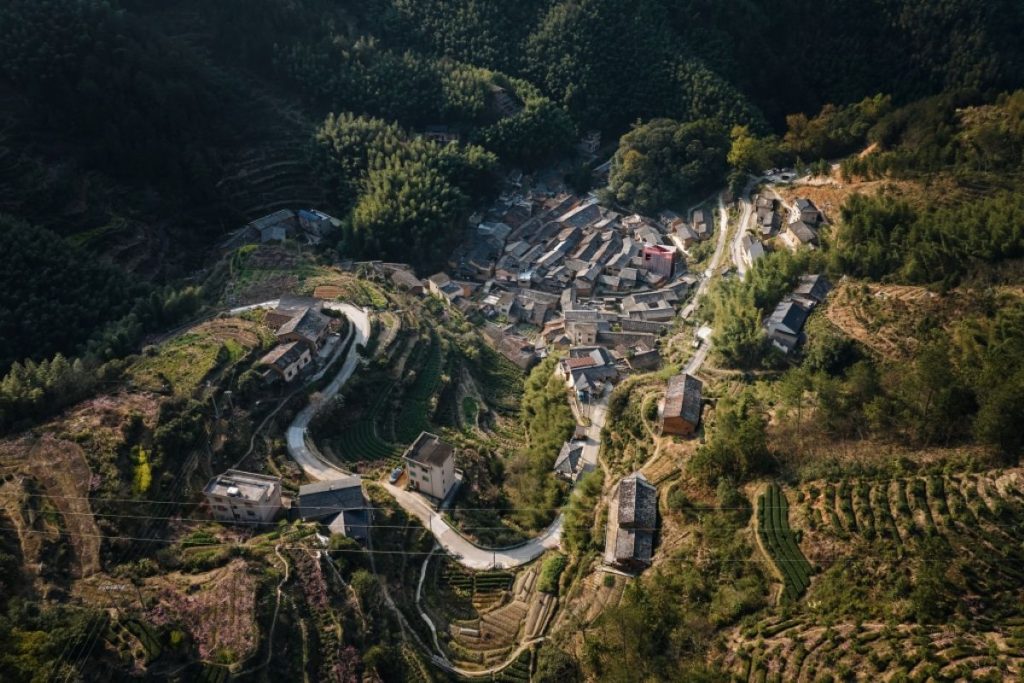
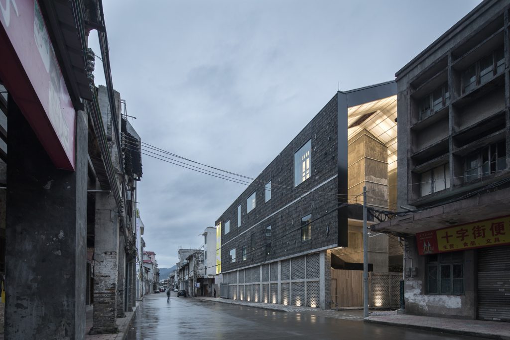
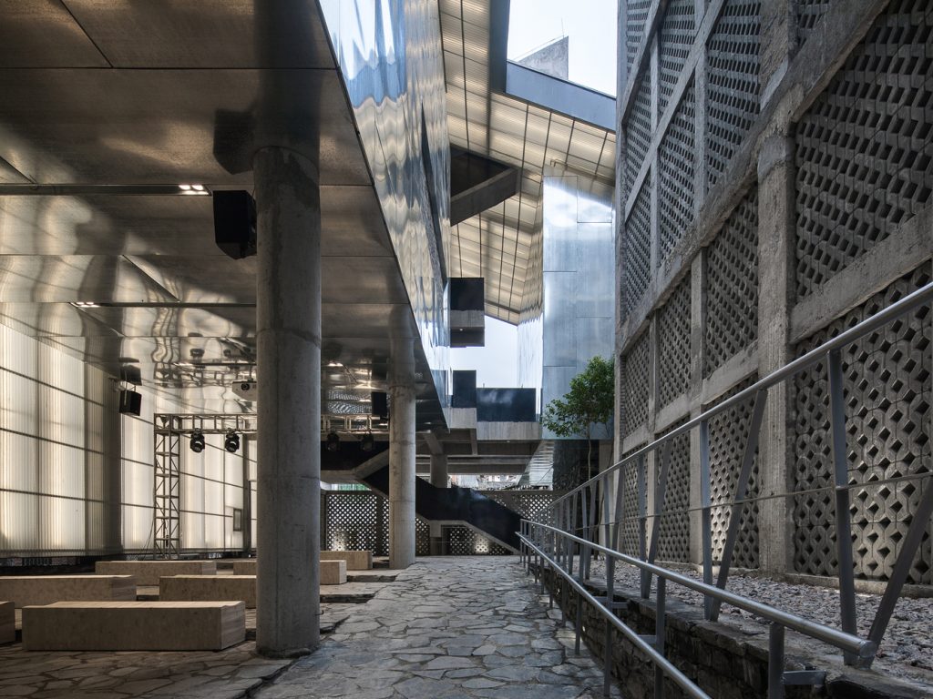
What marks this project out as unique and inspiring is its physical and spiritual integration into the fabric and community of Lianzhou, together with its visceral beauty. The new museum was built on the site of the local sugar mill, with the purpose of revitalising the traditional downtown of Lianzhou, a remote city in South China. At the heart of the complex is a retained and refurbished warehouse, wrapped around which is a U-shaped new structure on three to five levels, the two buildings being linked by a mainly external courtyard complex which weaves around galleries and meeting places, balancing contemporary arts with local identity. The complex’s folded roof canopy is built with largely recycled local building materials and local stones and the entire construction was completed by local workers using both modern construction and traditional craftsmanship, making this is an extremely low cost building.
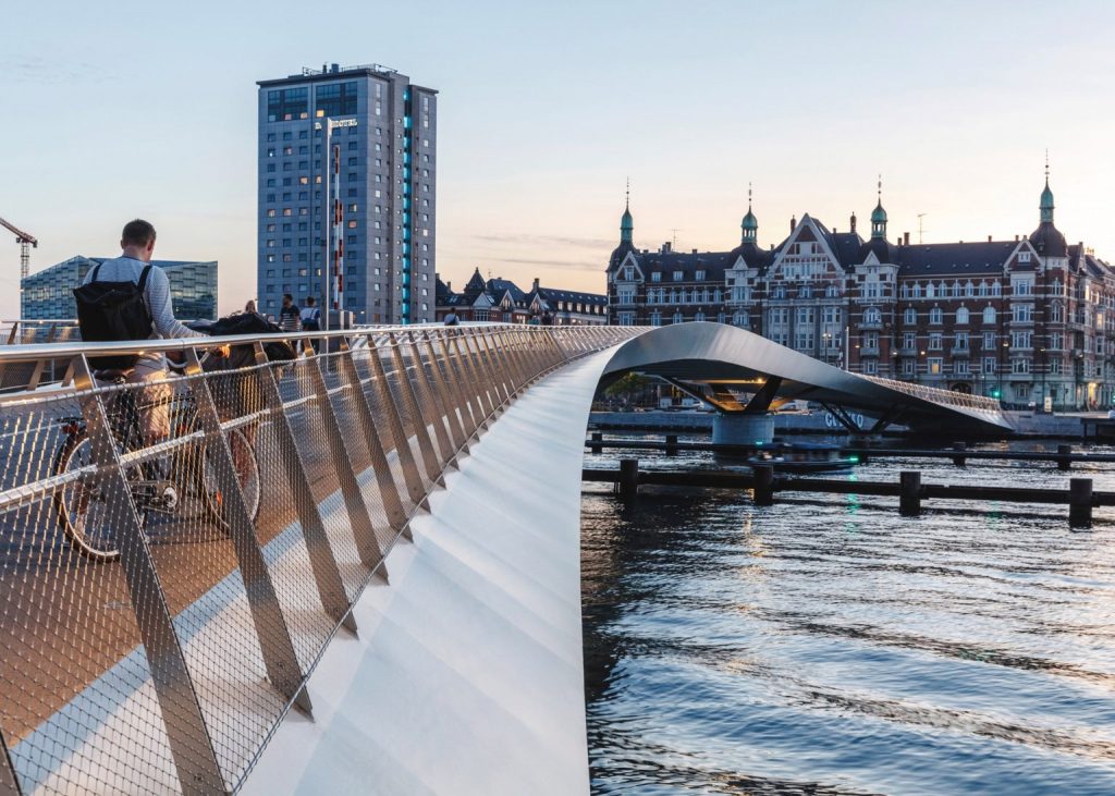
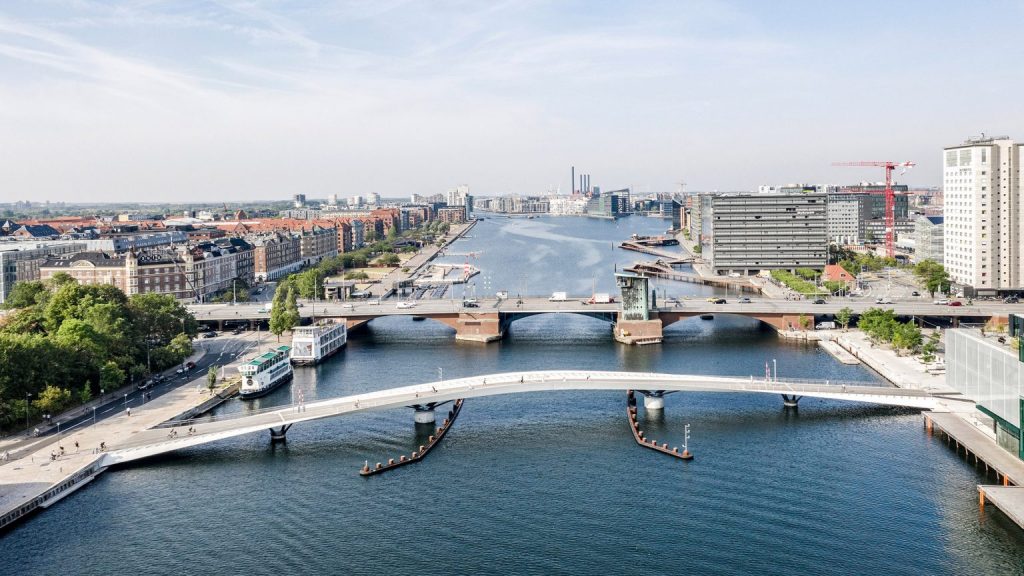
11. Lille Langebro by WilkinsonEyre with Urban Agency / Denmark
The bridge follows an elegant curve that aligns with the great arc of ramparts and moat of Christianshavn, revitalising a part of the harbour that had been underused for decades and reconnecting it to the city centre, with a structure that is both innovative and beautiful. Where the bridge abuts the quayside on either side, generous spaces are created which integrate this elegant piece of urban infrastructure seamlessly into the public realm. Located in the active harbour, the bridge had to allow for the passage of boats. This key requirement is at the heart of the project’s success and it has been achieved without compromising its inclusivity. Instead of relying on a raised structure with steep gradients to allow all boats to pass underneath, the bridge instead has two rotating central sections to allow larger boats to continue unobstructed on their journey.
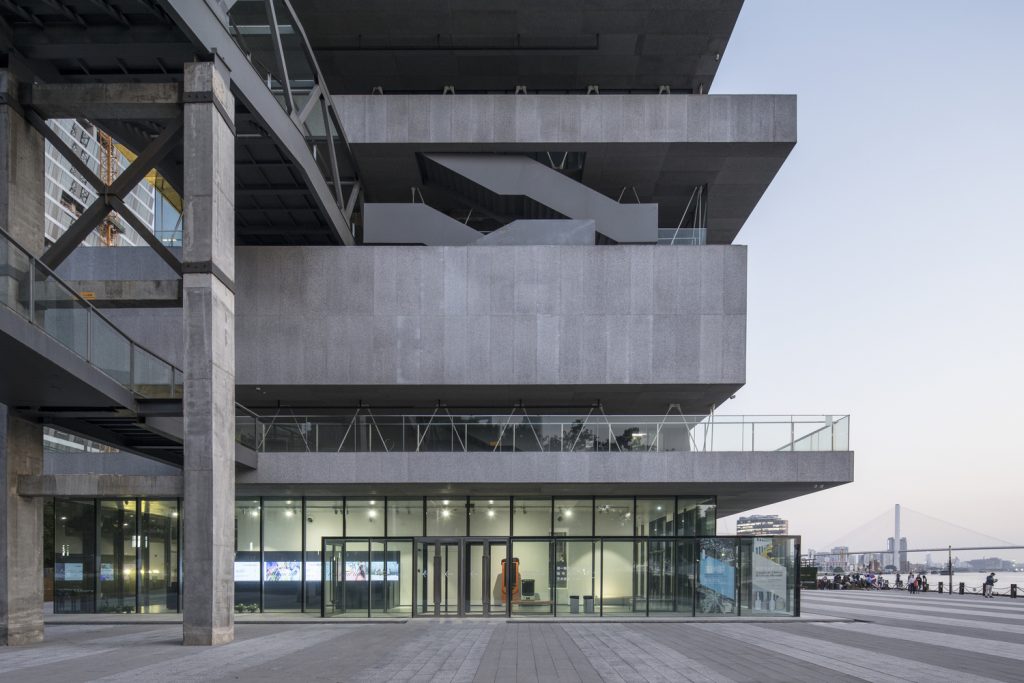
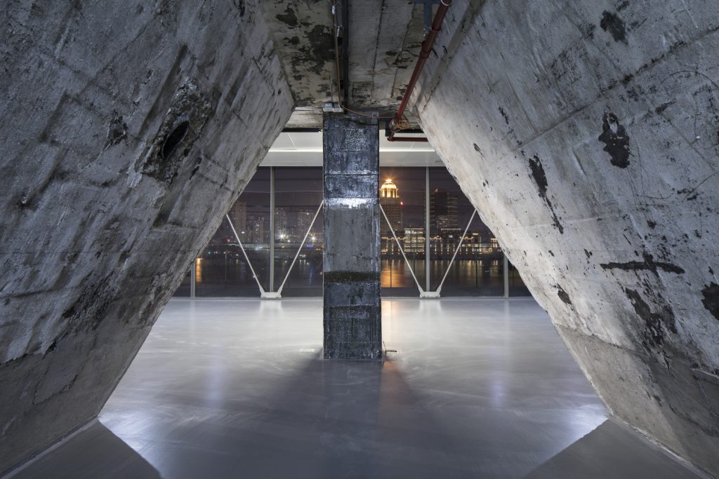
12. Modern Art Museum and its Walkways by Atelier Deshaus / China
The design and the programme of this museum have been developed opportunistically, almost in tandem with its construction. Originally the brief was to demolish the industrial building and build a new gallery. Halfway through the demolition, the budget and time constraints proved unworkable. The design team persuaded the client and government to retain the building, designing a temporary exhibition as part of SUSAS 2015 within it. All were convinced and the brief upgraded to a museum. The architects worked with the retained structures and by hanging and cantilevering all new steel construction from them with minimal means, they were able to complete it within the allotted six months and avoid the environmental impact implicit in demolition and reconstruction.
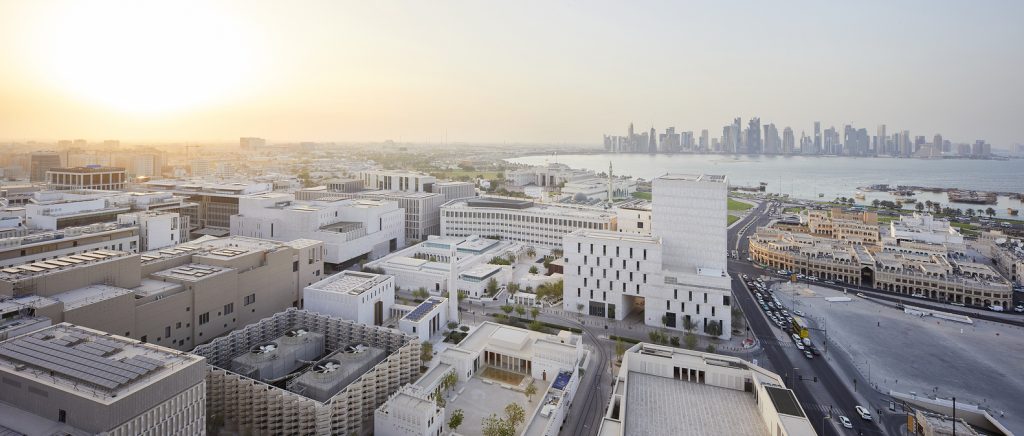
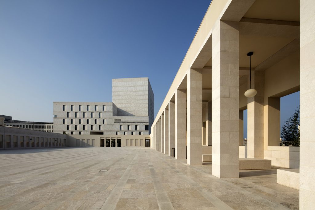
13. Msheireb Downtown Doha Masterplan by Allies and Morrison / Qatar
Until the later 20th century, Doha’s urban fabric consisted of tightly packed agglomerations of buildings separated by narrow alleyways, providing mutual shading. There were few motor vehicles, and the streets were built to a relatively small human scale. The recent meteoric growth in urbanisation, fuelled by the car and a transition to modernity, is reflected in architecture and urban design which departs abruptly from the vernacular. This masterplan attempts to change that direction of travel. Allies and Morrison developed a seven-step design code, a design manual and guidelines used across the district, leading to the project comprising a hundred plus new buildings, each distinct yet all expressing a shared architectural language rooted in the culture and the climate.
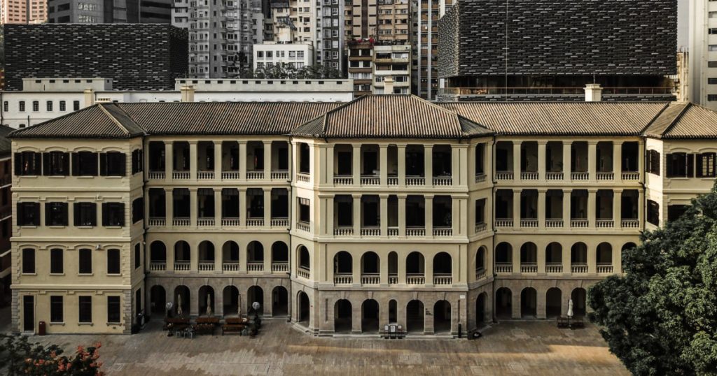
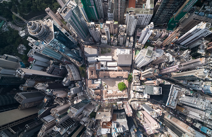
14. Tai Kwun – The Centre for Heritage and Arts by Purcell, Herzog & de Meuron, Rocco Design Associates Architects Limited / China
The Tai Kwun masterplan site, Hollywood Road, has long had an artistic spirit, linked to the antique markets further along in Shuen Wan, Staunton Street’s temples and historic houses, and budding independent galleries nearby. The Tai Kwun masterplan has unlocked connections amidst a maze of levels and existing buildings, by opening up the buildings that were the police headquarters and prison, preserving the historic square as stipulated by heritage and inserting two new museum buildings with well-connected external spaces. The larger-scale outdoor areas work as art and exhibition spaces, as well as morning Tai Chi spaces.
15. The National Memorial for Peace and Justice by MASS Design Group / Usa
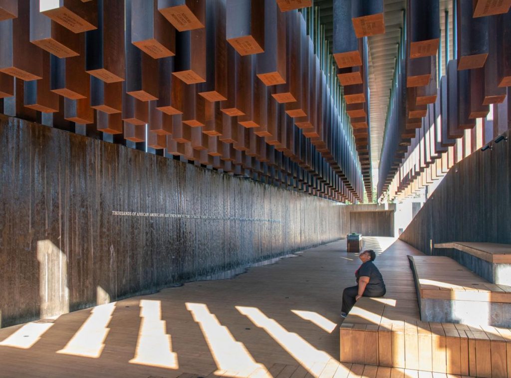
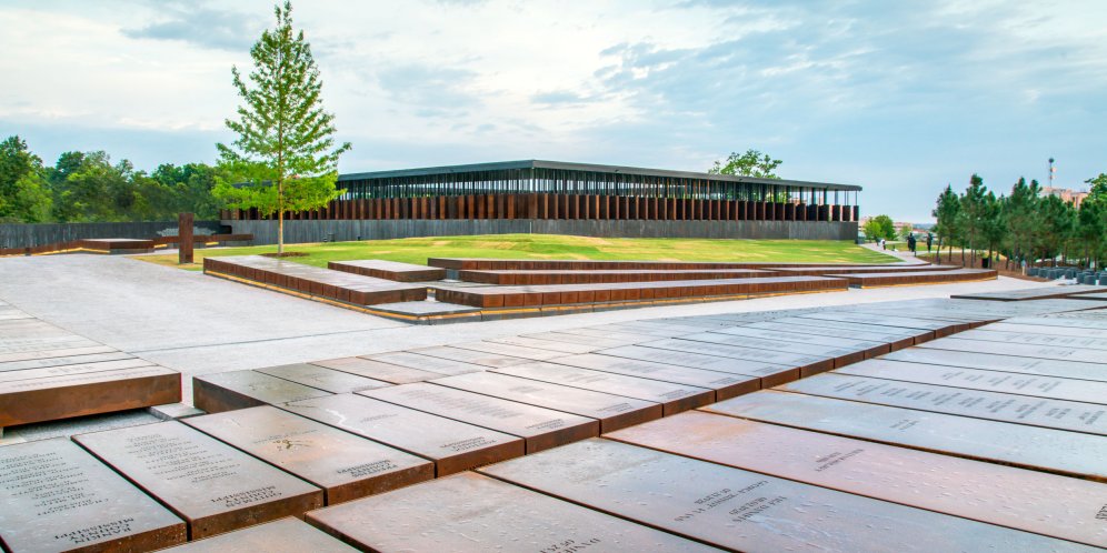
The National Memorial for Peace and Justice, in Montgomery, Alabama by MASS Design Group is America’s first memorial to the victims of racial terror lynchings. This project seeks to make visible and document this harrowing period of American history and transform national conversations around racial justice in America. From the entrance, the visitor is taken on a journey through a six acre landscaped public park towards a raised, open monument building at the park’s centre, and then through a series of internal and external spaces occupied by 810 Corten steel monuments. These monuments are placed in a variety of spaces and settings created for contemplation and reflection, and to capture both the gravity and horror of lynching and seek to honour the over 4000 individuals murdered across over 800 US counties. The soil collected from the sites of lynching in Alabama are displayed in glass jars in the Equal Justice Initiative’s Legacy Museum in Montgomery, Alabama, with the location and victims name in memory.
16. The Polygon Gallery by Patkau Architects / Canada
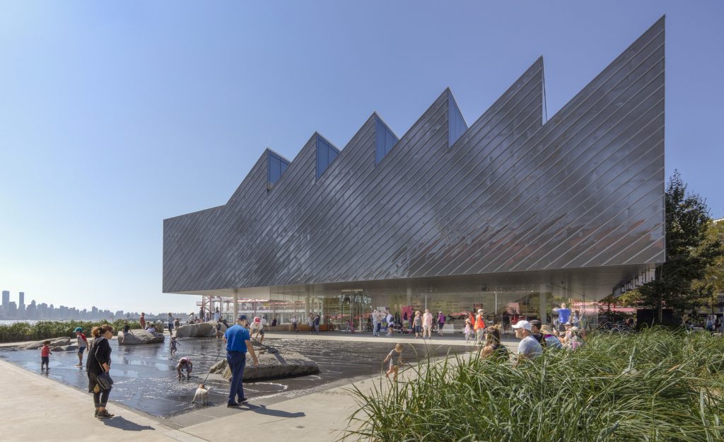
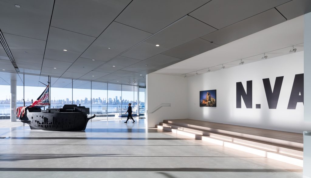
The Polygon Gallery is a new cultural hub on the decaying industrial waterfront of North Vancouver, a self-contained township with its own industrial and maritime heritage. The Polygon Gallery replaces a failing 1970s photography museum and finds its beauty in its usefulness. It carries forward the industrial language of its predecessor in its predominant cladding: an aluminium mesh of the kind used to make steps non-slip. These panels are set diagonally in order to echo the sawtooth roof – another industrial echo referencing the history and character of the site, while allowing excellent north light into the galleries by means of clerestories and other high windows. Underneath the mesh is a rainscreen of polished steel so that the mesh produces lovely diffused reflections of the trees – beauty and fitness for purpose perfectly combined.
