Aeon Hotel / noa* network of architecture
Boundaries – between past and future, between dream and reality, between inside and outside: noa* makes the invisible lines visible, which become part of the full picture and, above all, instead of a separation, a connection between two worlds.
It is a privilege to have the space to realize one’s own vision, nestled between one’s own meadows and woods, with an expanse that affords views from the Sciliar to the Rittner Horn, all the way to the Merano Alps and the Dolomites. The historic Lobishof, a perfect ensemble of an old inn, residential house, and traditional barn, is now writing the next chapter of its history with the next generation – one in which noa* has created the new, architectural framework.
From the very beginning, the 550-year-old farm turned out to be a valuable source of inspiration for the development process of the project, whose horizons allow one to look far and wide. In order to create a certain spatial analogy from the site’s history, a gentle bond was made to its past, through the layout of the building units and details – the entire of the new buildings is consciously modeled on the existing structure. “The creation of an ambivalent tension between the centuries-old tradition of the rural complex and an exclusively modern statement was the basic principle underlying the design process,” stresses architect Christian Rottensteiner in describing the initial approaches to the concept.
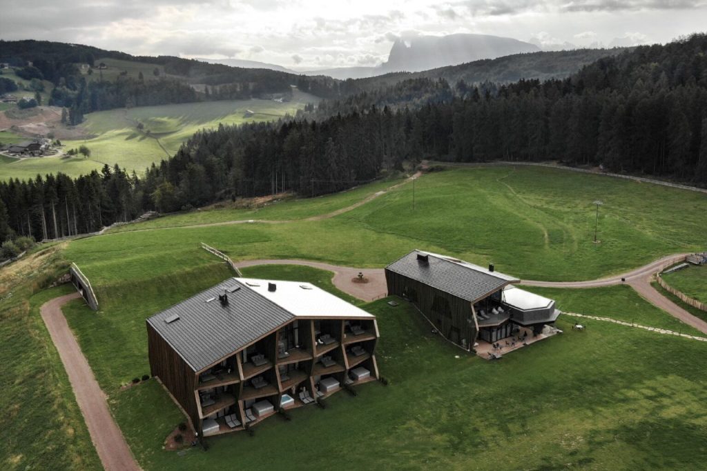
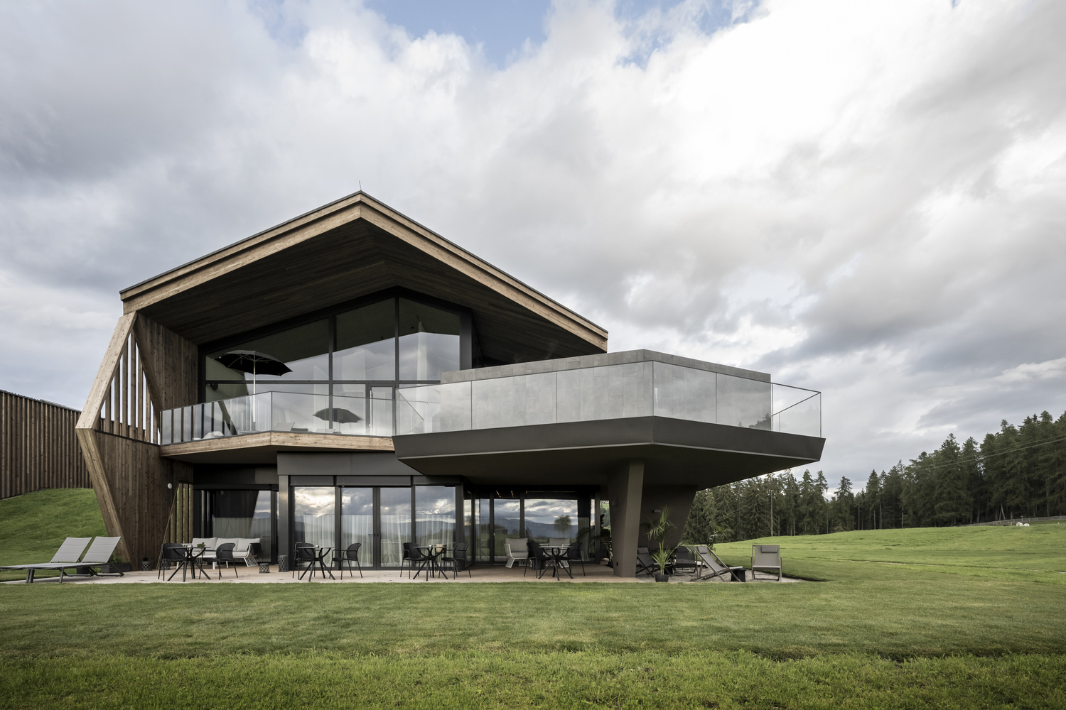
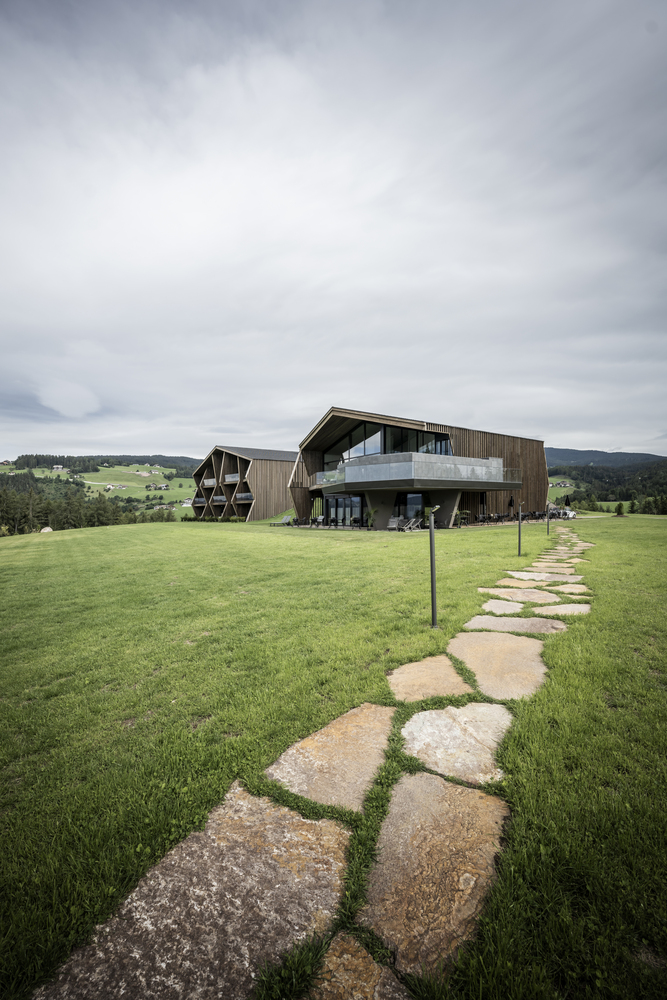
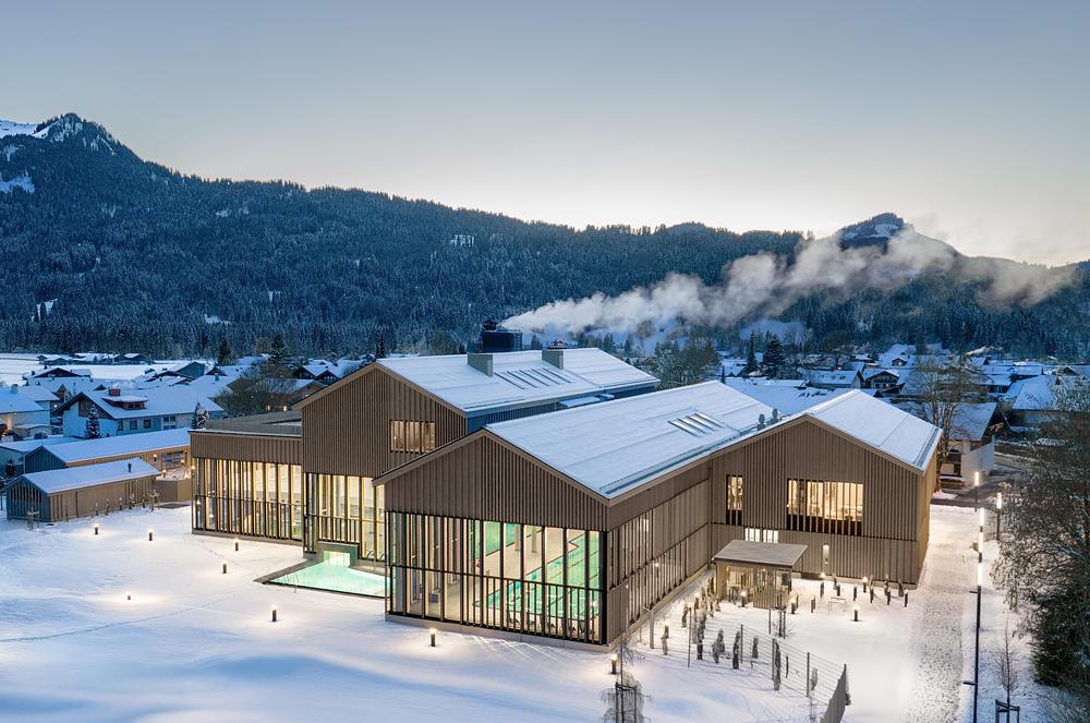
The result is two buildings, one hosting the public area with a reception, bistro, bar, and wellness area, the other the private area with a total of 15 guest suites. “The gentle topography we found and the arrangement of open and at the same time protected outdoor spaces conditioned the layout of the individual building volumes,” says Christian Rottensteiner in explaining the architectural concept. At first glance, they appear singular and together they form a permeable courtyard context. However, there is an ingenious connection, a hallway that elegantly vanishes under an artificially created hill – hence disappearing out of sight.
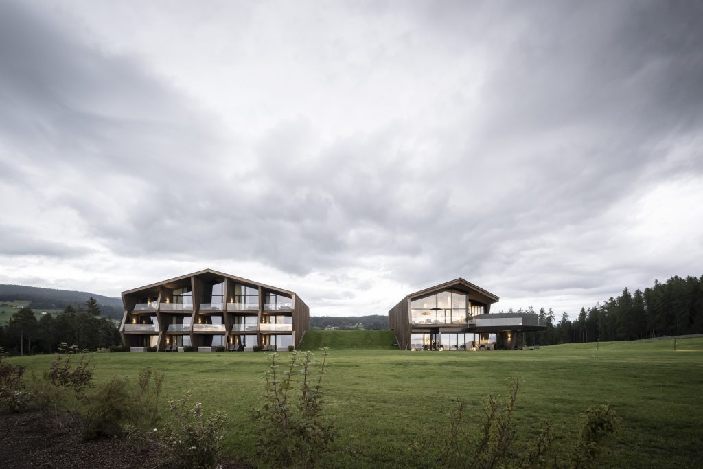
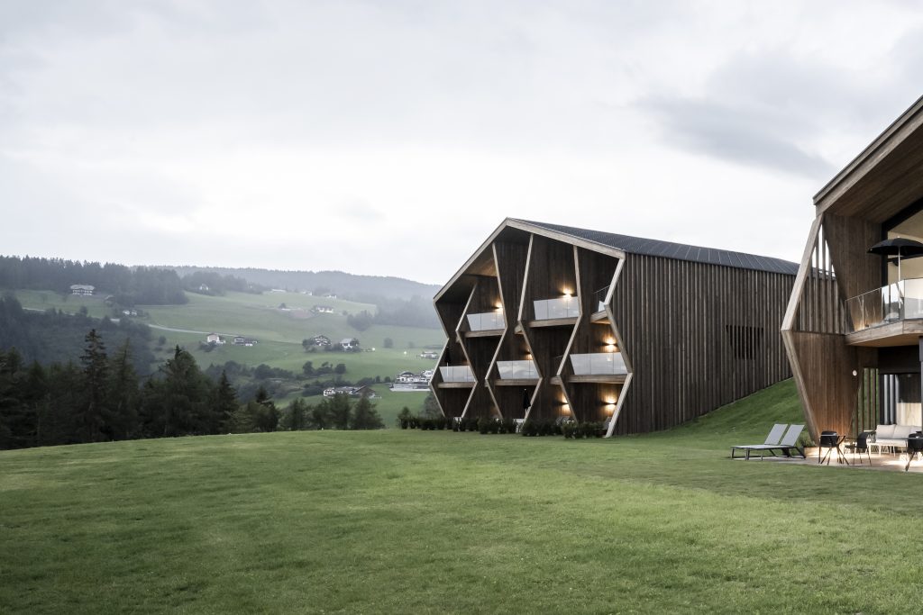
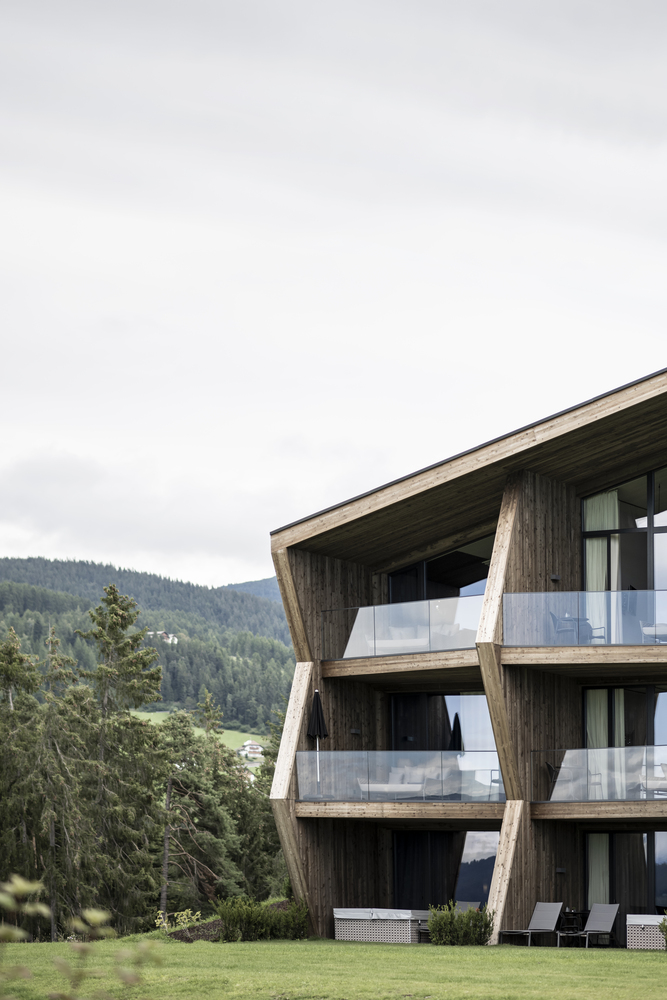
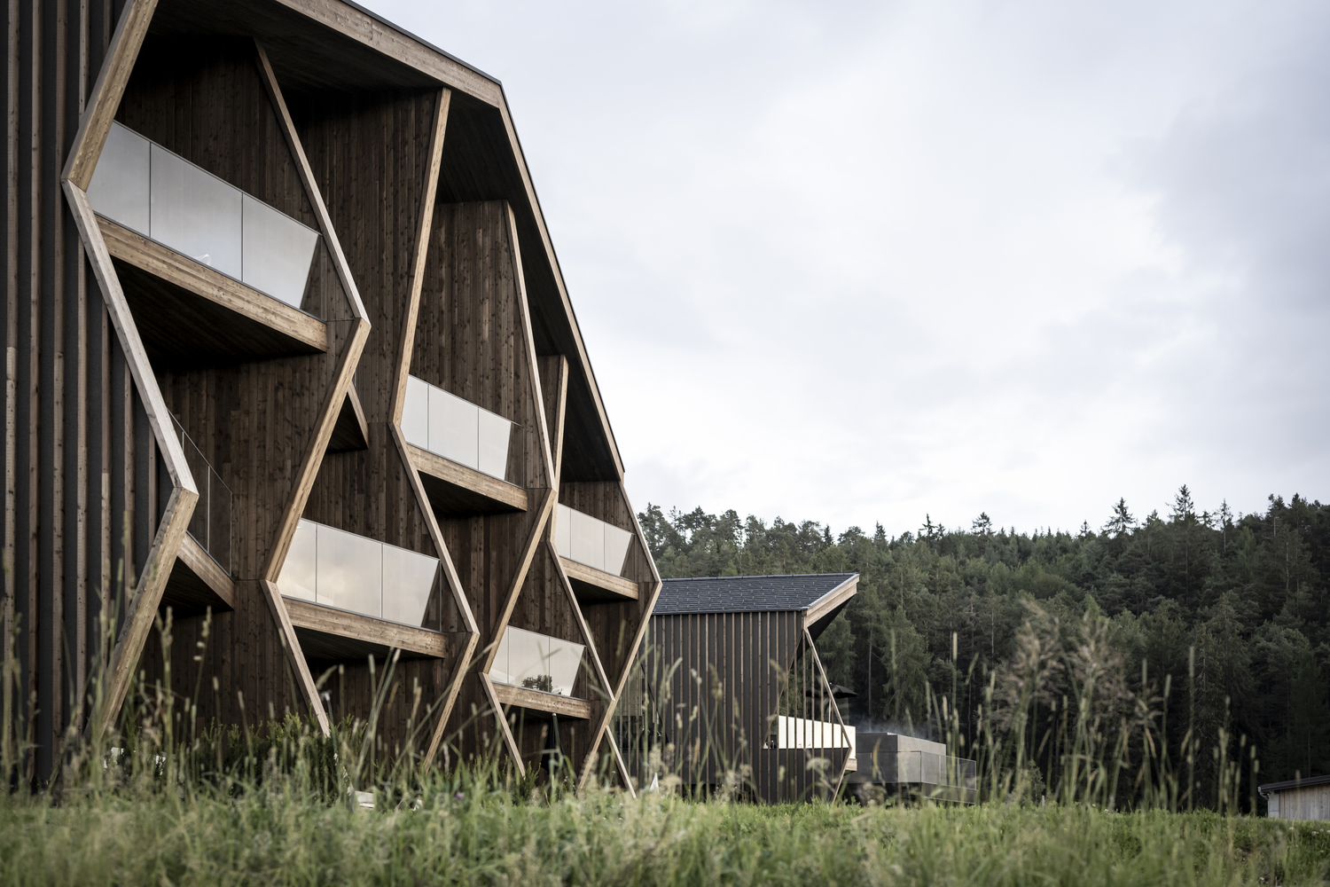
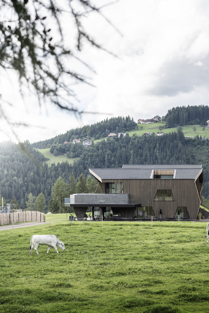
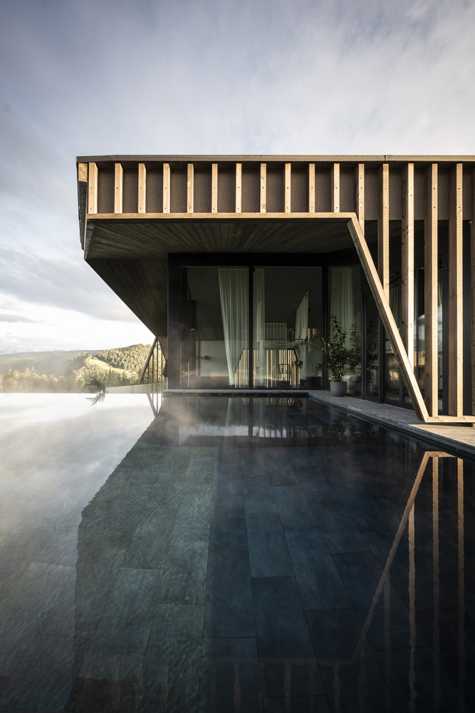
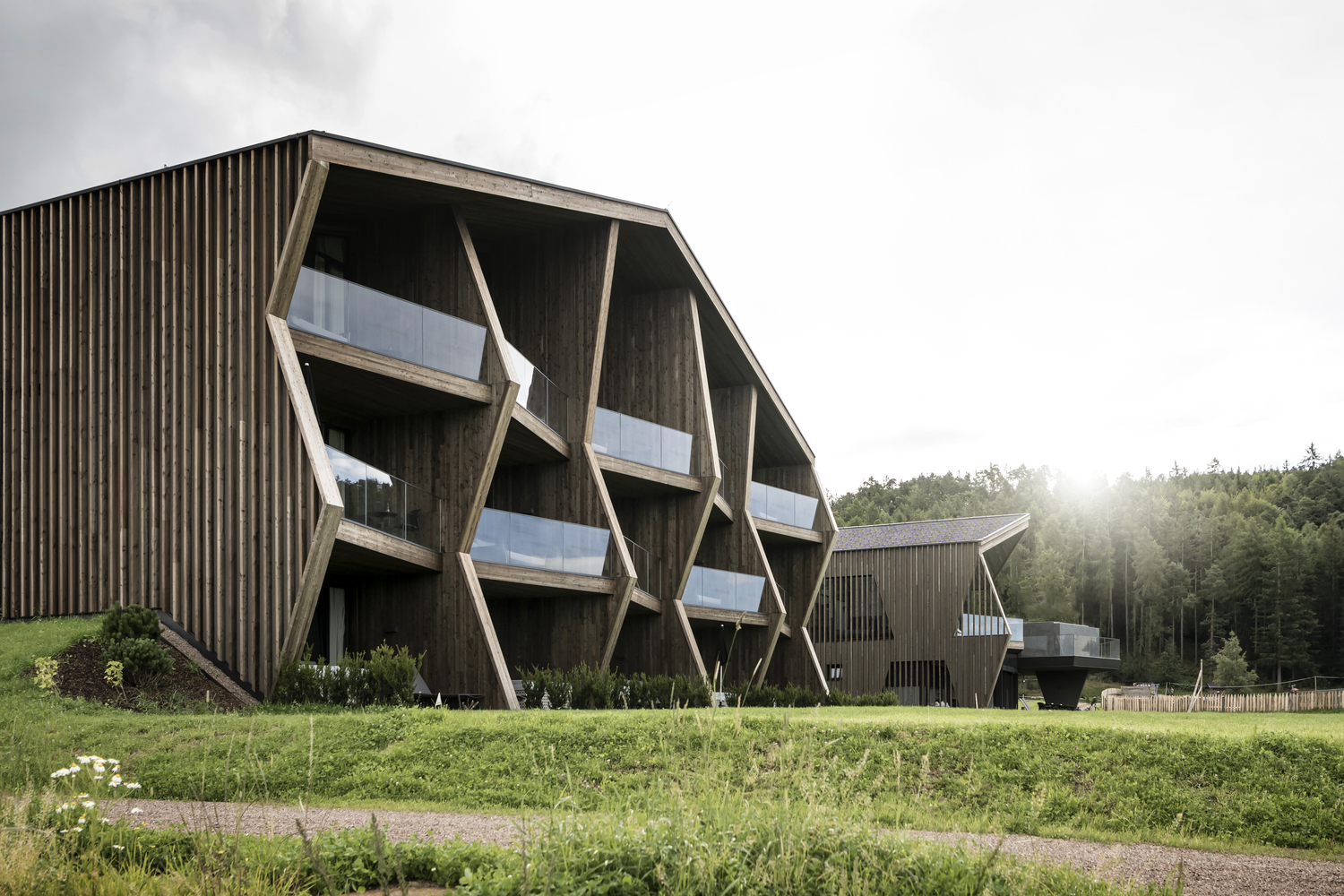
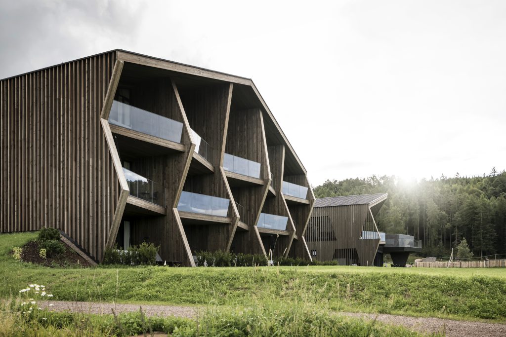
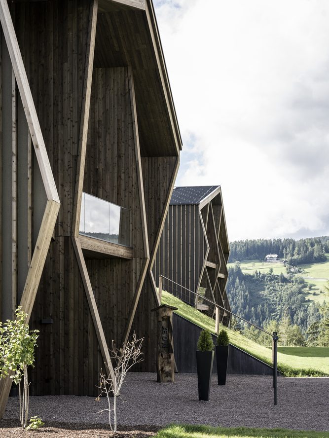
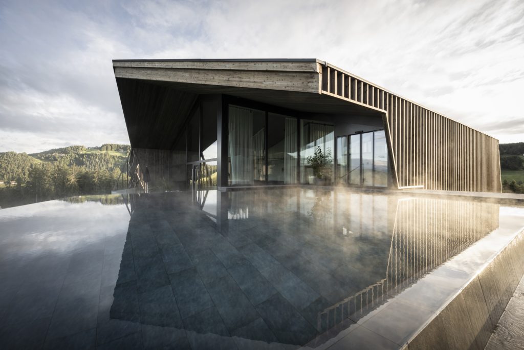
The two buildings also establish a strong bond with the existing structures in their design language. You can find traditional gable roofs, as well as a very dynamic façade design with reinforcing slanted elements, that replicate the design of the struts and brackets of the historically listed barn while translating them into a modern statement. This allows the facades to be perceived differently – depending on how one approaches the edifice.
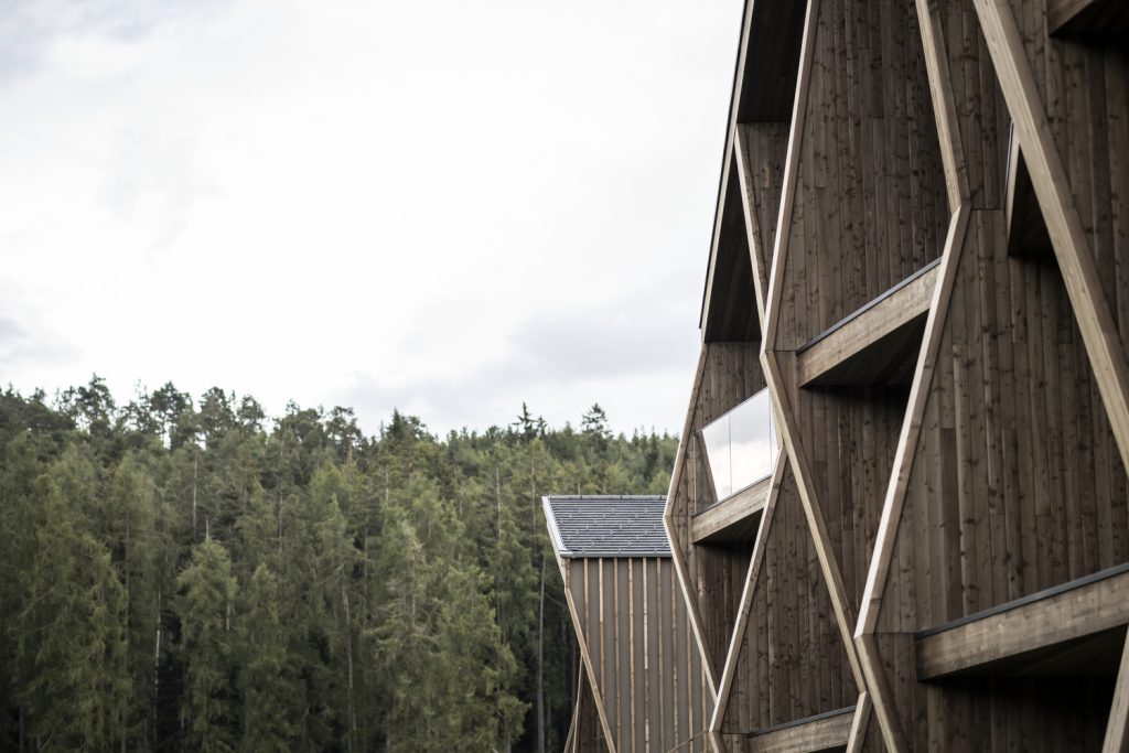
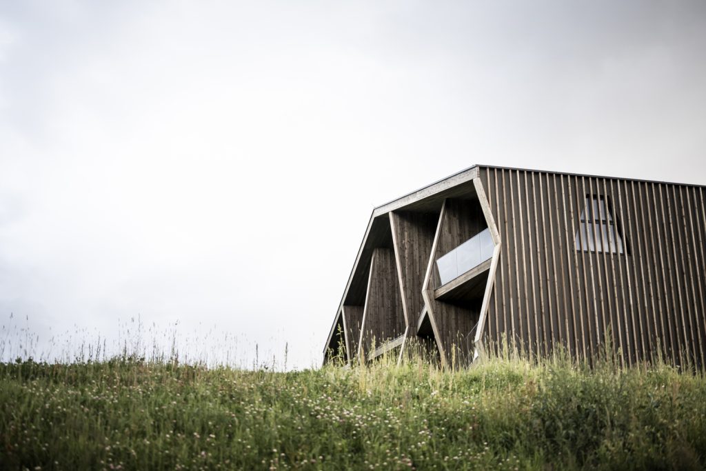
The trapezoid windows catch the eye in a striking way. The upper, slatted structure that stretches over the entire length of the building almost disguises the stories and create a homogeneous appearance. The entire project takes life from its many sophisticated details and stories, which always revolve around the family and the place where the project unfolds. For example, wood from the farm’s own woods was used. The renewable raw material makes the architecture accessible and underscores its vitality through the projections and recesses that create exciting shadows. Guests enter the building through an entrance portal made of black steel, which bears the family’s old coat of arms from 1464 on the outside.
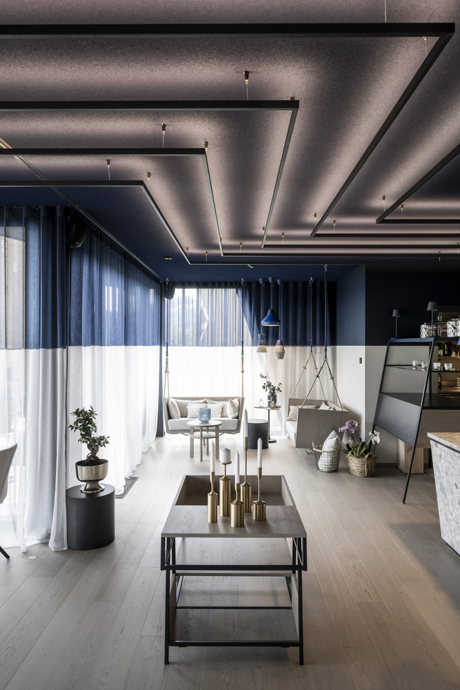
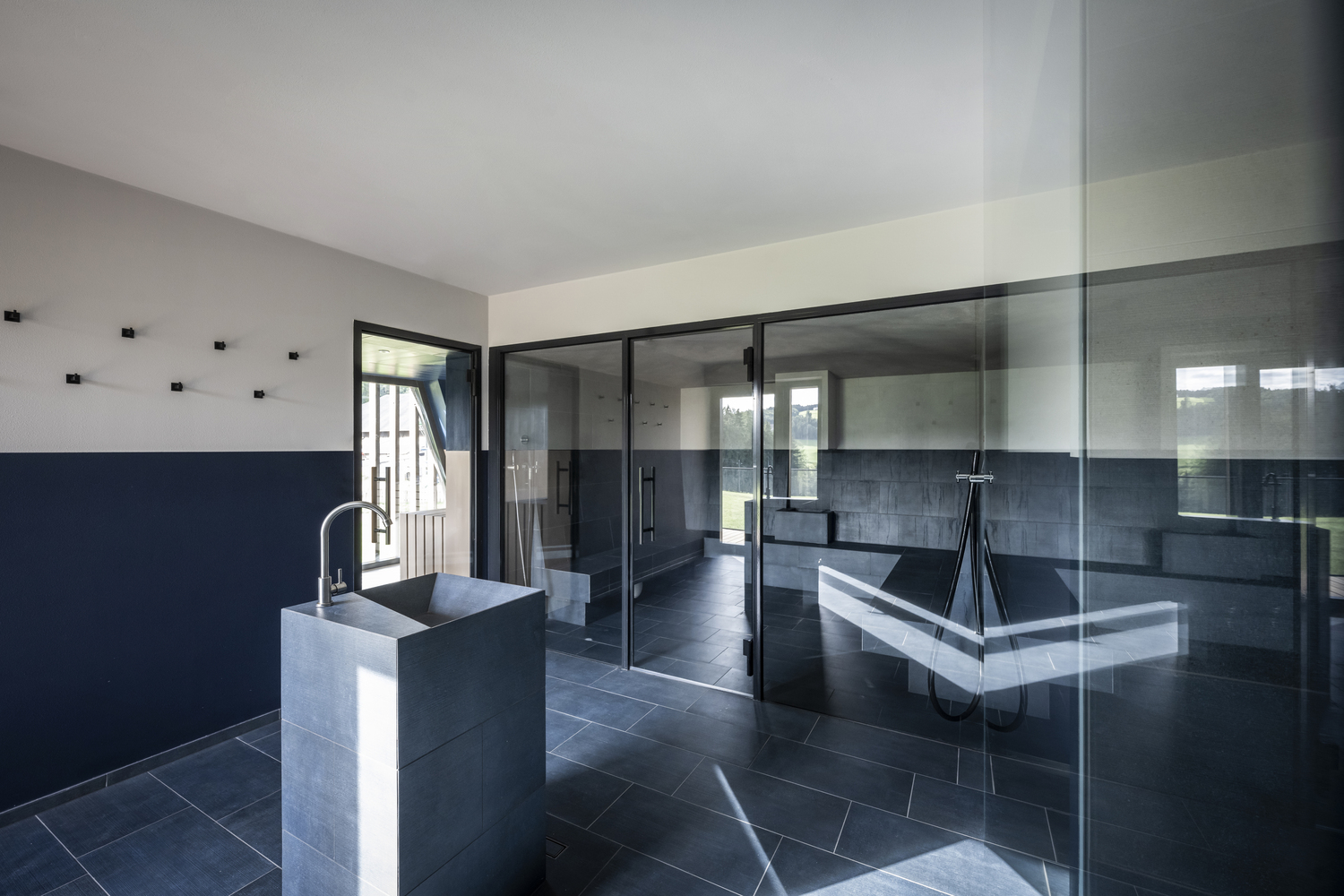
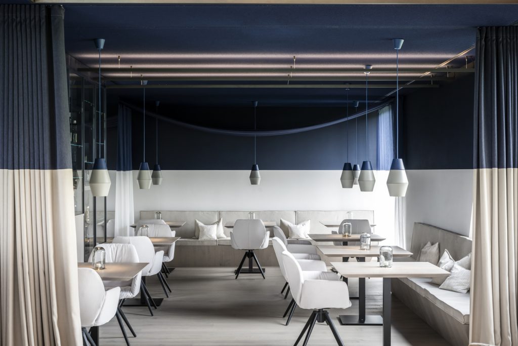
Stepping through the steel front door through the entrance area, one experiences an intense and extraordinary breakthrough, an immersion into something that atmospherically represents the future – because the entire interior is characterized by a colorful, horizontal dichotomy: A soft beige – communicates feelings of being grounded, familiar, delicateness – meets a mystical blue that embodies the future, the mysterious, the uncertain. In the public building, the sharp-edged transition between beige and blue takes place at eye level, at a height of 1.60 meters, to make this “in between zone” tangible. But the concept is not centered only on the floors, walls, and ceilings: All the furnishings – from the curtains, through the furniture to the light fixtures – are part of a holistic approach.
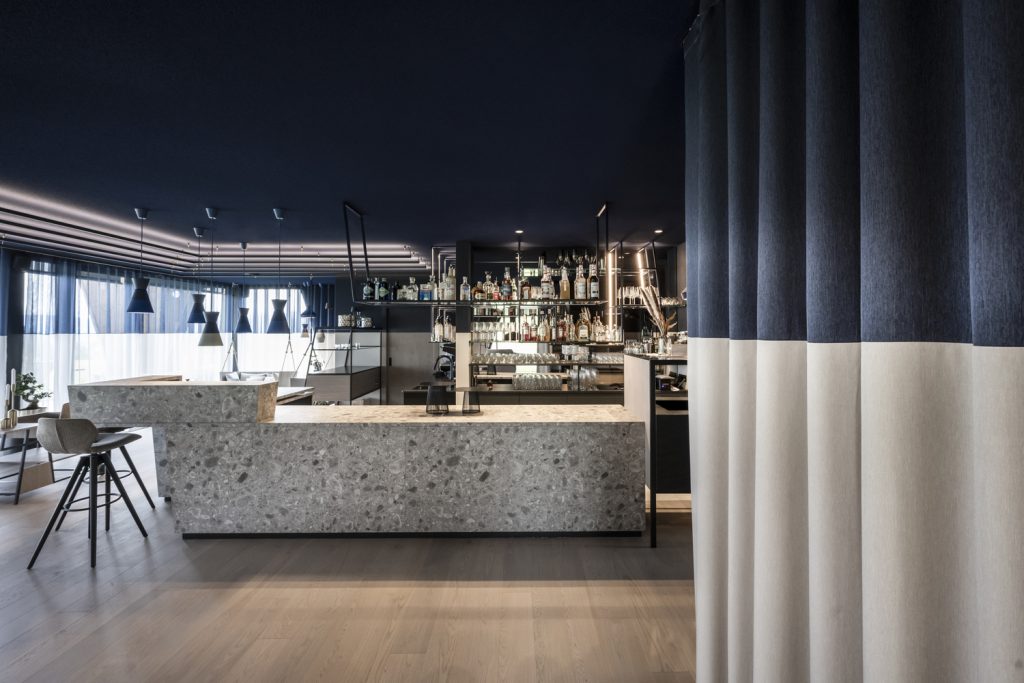
On the ground floor, a multi-functional room opens up to the visitor. While the reception, which features a discreet desk, welcomes the guests, the bar, with its unique details, catches the eye and invites to explore the surroundings: a large wine display in the middle of comfortable bistro tables, the panoramic parlor that can be flexibly played with, the lounge area with open fireplace and mirrored ceiling, as well as the reading corner with hanging sofas, somewhat out of the way, define the space. Large window surfaces allow the surrounding nature to become an integral part of the room.
The wellness area is located on the first floor of this building. On the way up, one “dives” through the horizontal blue and finds oneself in the opposite color concept: as a symbol for water, the blue is now below. Once past the inviting fruit bar and the drinking fountain, the wide relaxation space and adjoining terrace open up. But the spa has much
more to offer. The spectacular, half covered outdoor infinity pool juts out from the southwest side of the building, affording spectacular views. It can be reached via a platform, the top level of which marks the “water’s edge,” marking once again the alternation between blue and beige.
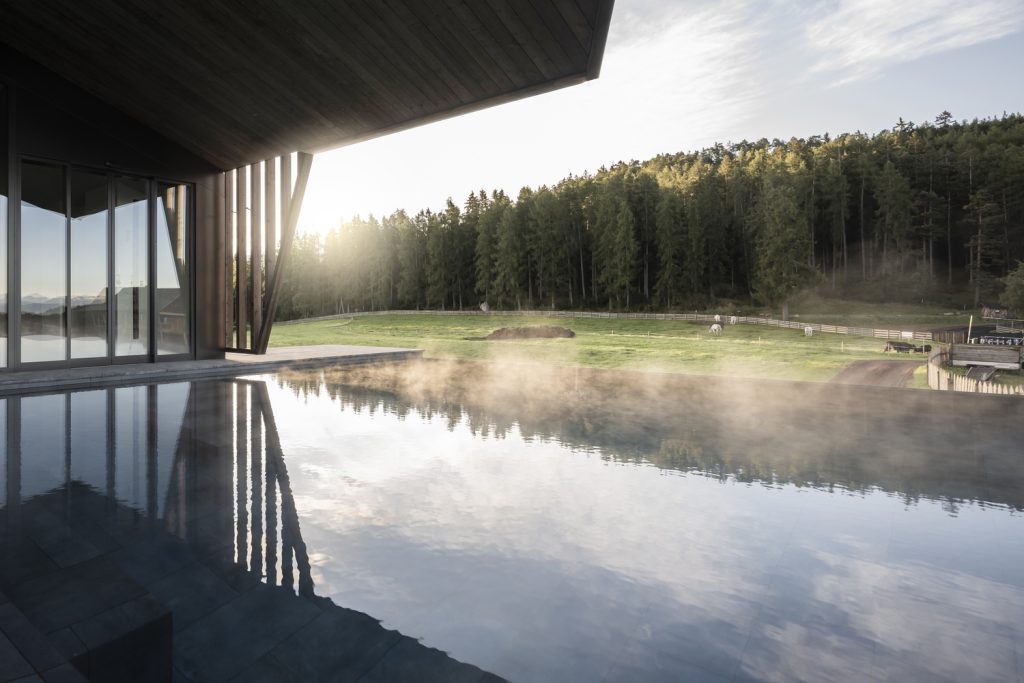
Just a few more steps up is a separate relaxation area that one can use as a meditation room, for yoga or relax. Right in front of it, in the outdoor area, is a whirlpool on a roof terrace with a view of the Dolomites. Immediately below, to the southeast, is the textile free area. The steam bath and the Finnish sauna are accessed through an anteroom with a large drinking fountain and shower facilities. While the steam-bath is located in a rather “introverted” position and directs the view to the water fountain and the sauna, which are more extroverted and open, with a view of the surrounding mystical woods.
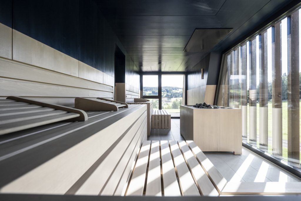
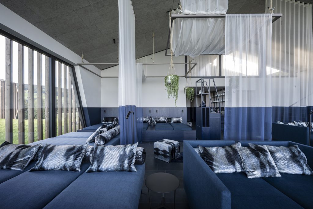
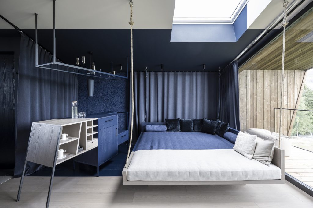
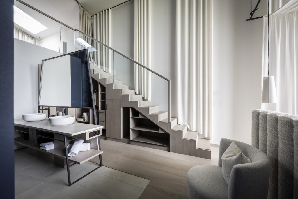
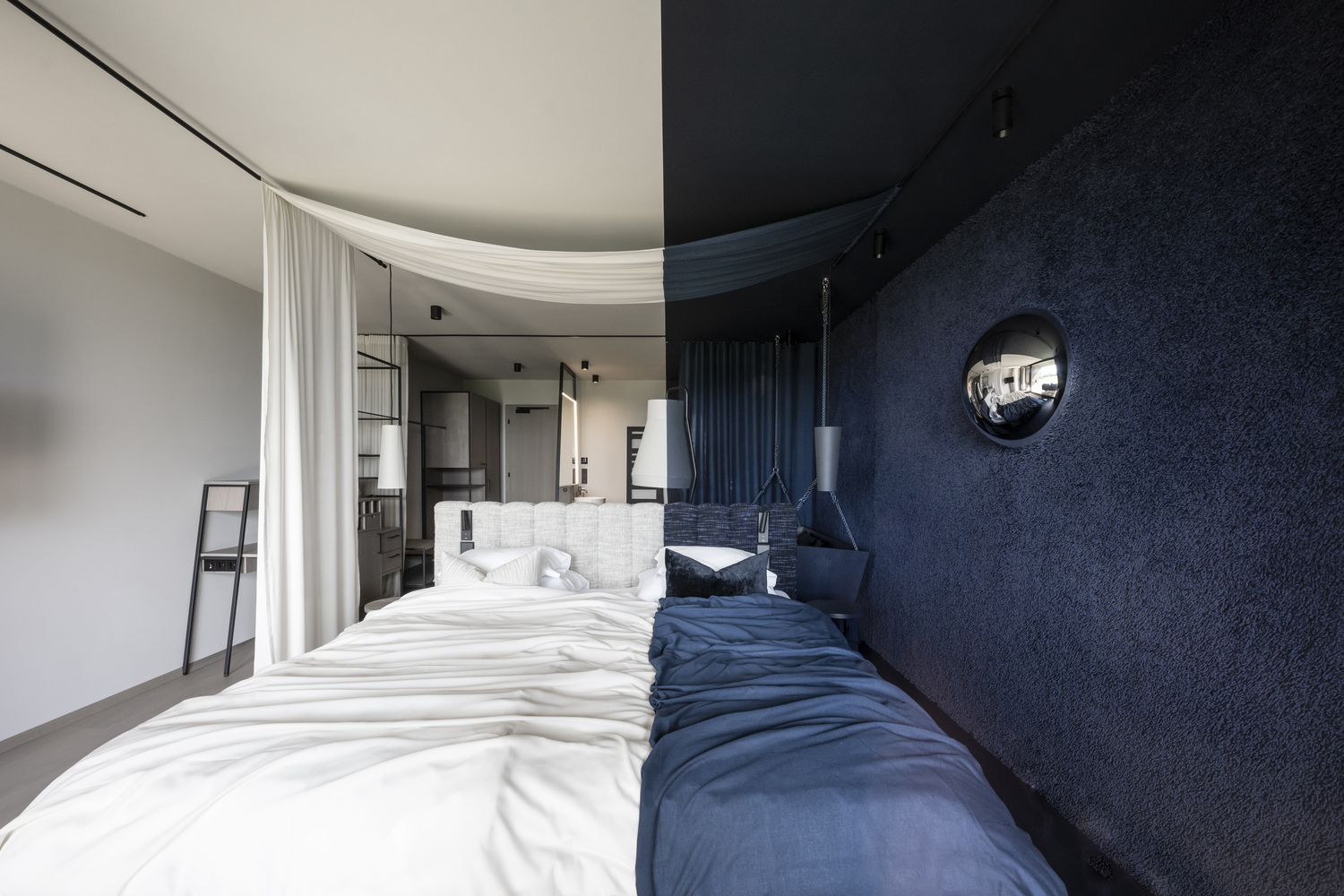
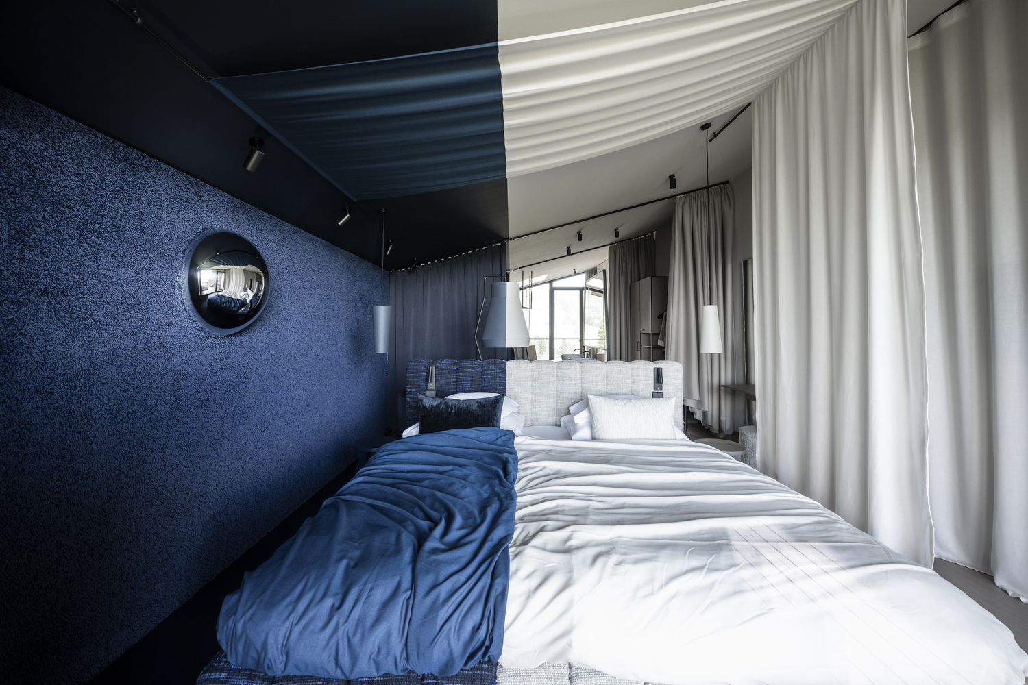
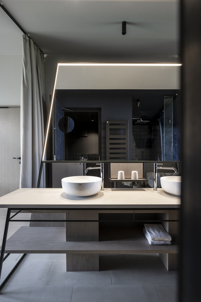
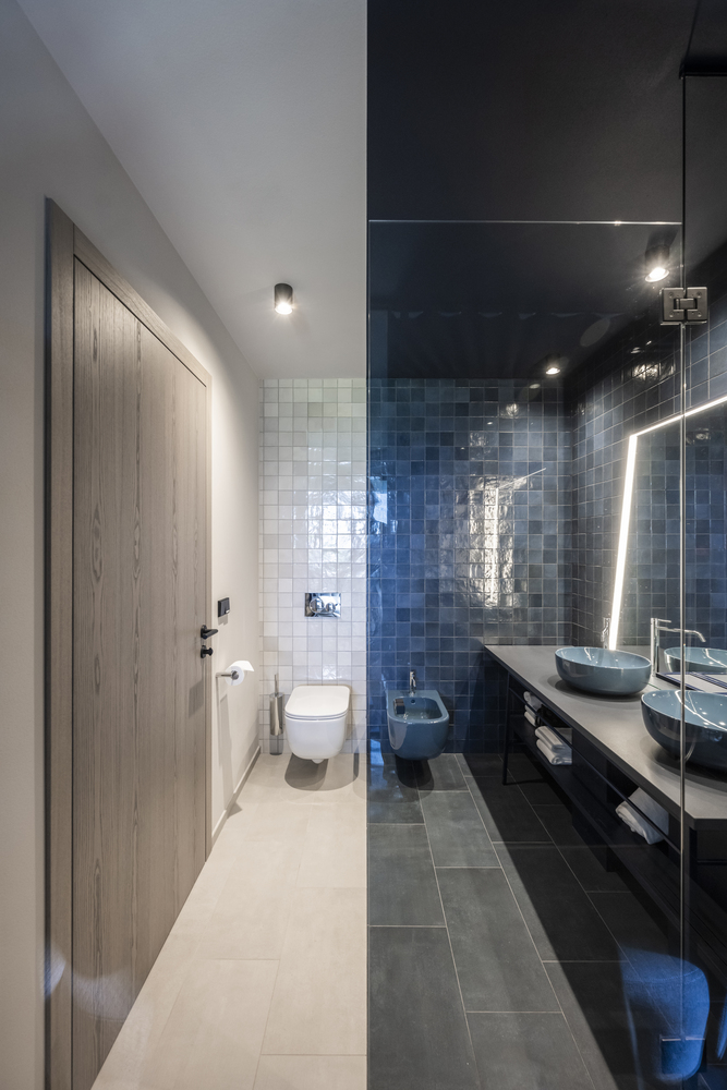
The second building, which unlike its counterpart has three floors, hosts the 15 suites of the new hotel. The two buildings are connected to each other via an underground corridor, and here too the division of the color worlds takes a 90-degree turn: What was horizontal is now vertical. There is a deliberate psychological effect in play here, because from here on you can immerse your whole body in the respective area, which has an overall relaxing effect. Basically, there are three types of rooms, which differ in size and furnishings. In terms of color division, no compromises are made in the suites either: about one third of their surface is blue, two thirds beige, where a certain blending of the areas takes place through the dynamics applied. The light, partly floating, linear furniture takes inspiration from the architecture and is divided ruthlessly into two. The walls are covered in fabric, almost dematerializing them with a surface that is not perceived as a wall.
